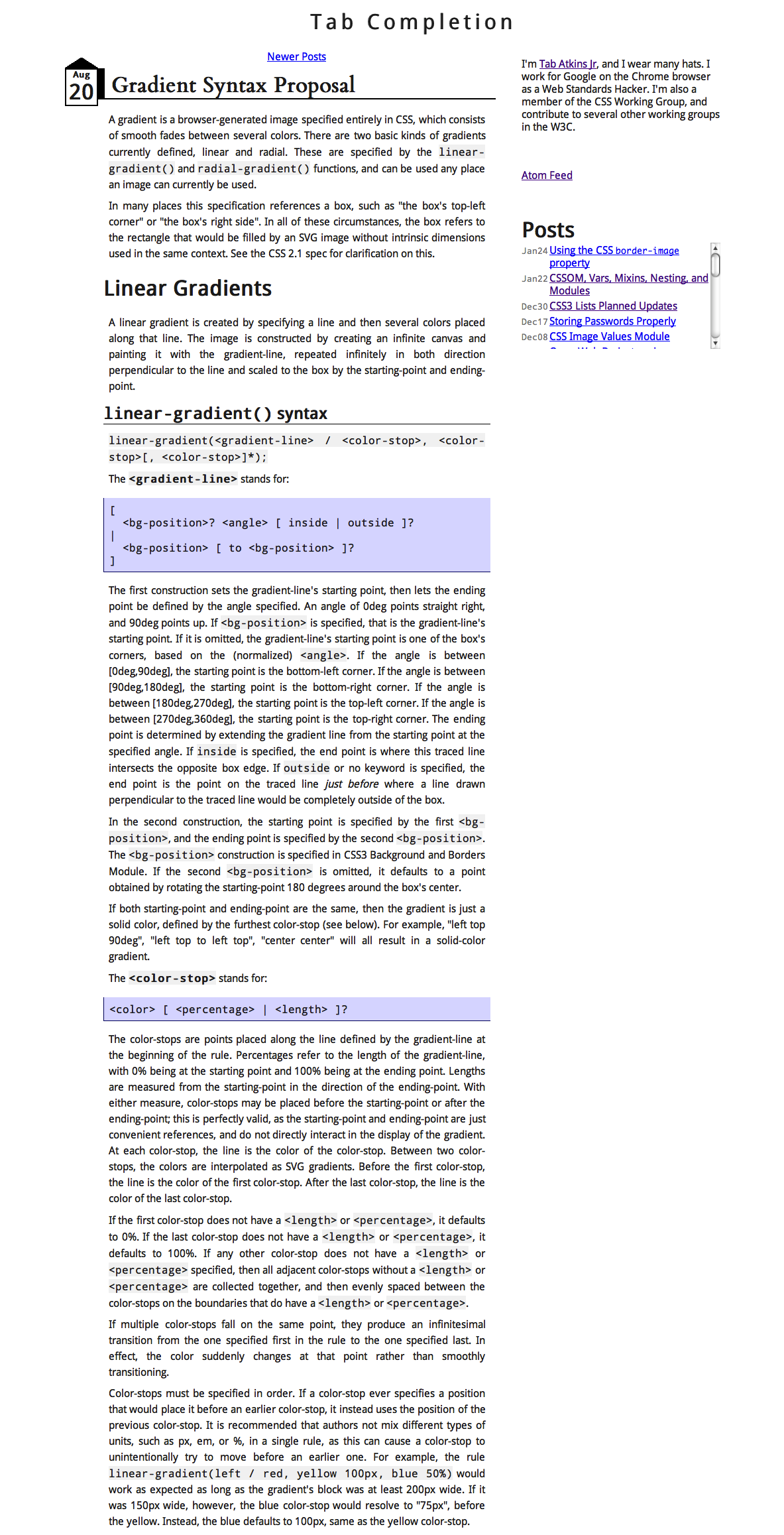
CSS3 gradients From #000 to #fff in 45 minutes

Note: This was made for conference talks displayed locally in Firefox 4, so it naturally looks/works better there. Use the arrow keys to navigate. Screenshots of how it was used here.

By Lea Verou (@LeaVerou)

What’s a gradient?

Shapes of incrementally closer colors next to each other, creating the illusion of a smooth transition

Linear gradients:
parallel lines
Radial gradients:
concentric ellipses

Useful?

microsoft.com screenshot from 1997
1997
current apple.com screenshot
2011

Gradients in CSS

with bitmap bg images

background: url(gradient.png) repeat-x;
Cross-browser compatibility
Excellent
Speed
Large filesize
Extra HTTP request
Ease of changes
Tedious as hell

Gradients in CSS

Native CSS gradients

background: linear-gradient(#000, #fff);
Cross-browser compatibility
Limited
Speed
Small filesize
Νo extra HTTP request
Ease of changes
A snap!

Native CSS gradients

Images with no intrinsic dimensions

Resize me

Native CSS gradients

* in theory

Linear gradients

Basic syntax

Linear gradient angles

left = 0deg

bottom left

bottom = 90deg

bottom right

right = 180deg

top right

top = 270deg

top left

bottom left ≠ 45deg

bottom left
45deg

Color-stop me now

Diagonal stripes

with linear gradients

Diagonal stripes

with repeating gradients

Diagonal stripes

Comparison

With simple linear gradients
-webkit-gradient() equivalent?
Easy
Conciseness
Verbose
Ease of changes
Very hard for angle
4 edits for colors
2 edits for size
With repeating gradients
-webkit-gradient() equivalent?
None
Conciseness
Concise
Ease of changes
1 edit for angle
2 edits for colors
2n-1 edits for size

Easier color changes

More CSS3 patterns

Screenshot from my CSS3 patterns gallery

http://lea.verou.me/css3patterns

CSS3 patterns

To use or not to use?

Corner tricks

Beveled corners

Beware of transparent

transparent = rgba(0,0,0,0) = transparent black

Radial gradients

Basic syntax

radial-gradient(25% 30%, farthest-side, gray, black)

Basic syntax

Shape and size

Corner tricks

Negative border-radius

A bit of history

-webkit-gradient()

Early 2008

Screenshot from the blog post announcing the introduction of -webkit-gradient()

-webkit-gradient()

background: -webkit-gradient(
	linear,
	0 0, left bottom,
	from(black),
	color-stop(.6, hsl(180,50%,35%)),
	to(#b0a089)
);

-webkit-gradient()

-webkit-gradient()

Mozilla implements
CSS gradients

Early August 2009

A new syntax

August 2009

Tab Atkins Jr drafts a proposal with a much better syntax

Screenshot from the Tab's original proposal

A new syntax

November 2009

Screenshot from the MozHacks post

How better?

—vs—

background:
gradient(linear, 0 0, left bottom, from(black), 
color-stop(.6, hsl(180,50%,35%)), to(#b0a089));

(-moz- and -webkit- prefixes omitted for fairer comparison)

What did we lose?

-webkit-gradient() pie charts http://jsfiddle.net/leaverou/2BDtZ/

Additions

Implementations?

Early 2011

So currently, all browsers support them!

What’s next?

Conical gradients?

Conical checkerboard tile Conical diagonal checkerboard tile Hue wheel

And more…

Screenshot from twitter homepage showing a conical gradient on the header

conical-gradient()?

Conical gradients sound good, so I'll keep them in mind when I draft Image Values 4.
Tab Atkins

Getting real

Browser support

Browser support

Internet Explorer < 10

IE < 10 supports a few basic cases through filters:

filter: progid:DXImageTransform.Microsoft.gradient(
	        GradientType=0,
	        startColorstr='#81a8cb',
	        endColorstr='#4477a1'
);

Emulating gradients with box-shadow

SVG gradients

Opera 9.5+, Firefox 4, Safari 5+, Chrome 7+, IE9

<svg xmlns="http://www.w3.org/2000/svg">
    <defs>
        <linearGradient id="gradient" y2="100%">
            <stop stop-color="silver" />
            <stop stop-color="black" offset="100%" />
        </linearGradient>
    </defs>
    <rect width="100%" height="100%" fill="url(#gradient)"></rect>
</svg>

Putting it together

Ikea cat - Some assembly required http://lokwi.com/item/1559

Putting it together

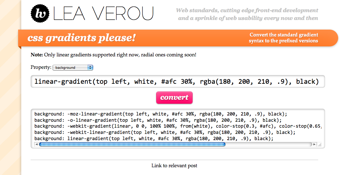
For a bulletproof background

background: #5A5A5A url(gradient.svg);
background-image: -moz-linear-gradient(top left, silver, black);
background-image: -ms-linear-gradient(top left, silver, black);
background-image: -o-linear-gradient(top left, silver, black);
background-image: -webkit-gradient(linear, 0 0, 100% 100%, from(silver), to(black));
background-image: -webkit-linear-gradient(top left, silver, black);
background-image: linear-gradient(top left, silver, black);
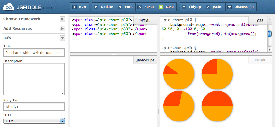
Putting it together

Automatically!

Screenshot from an automatic converter

http://lea.verou.me/demos/cssgradientsplease

Questions?

Thank you!

My company (fresset)