API Design is UI Design

By Lea Verou
MIT • W3C TAG • CSS WG • TC39

Ever used an API* that caused you pain?

* Library, framework, component, built-in JS class or function, HTML element, CSS property, etc.

Raise your hand if you’ve ever used an API that caused you pain. Nothing worked in the way you’d expect so you had to constantly look at the docs, everything produced errors, and you had to copy-pasta a ton of boilerplate. Seems familiar? Yeah, me too.
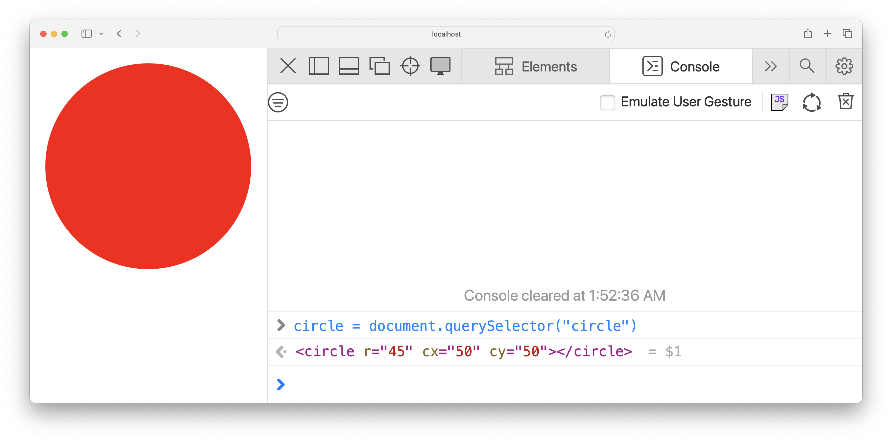
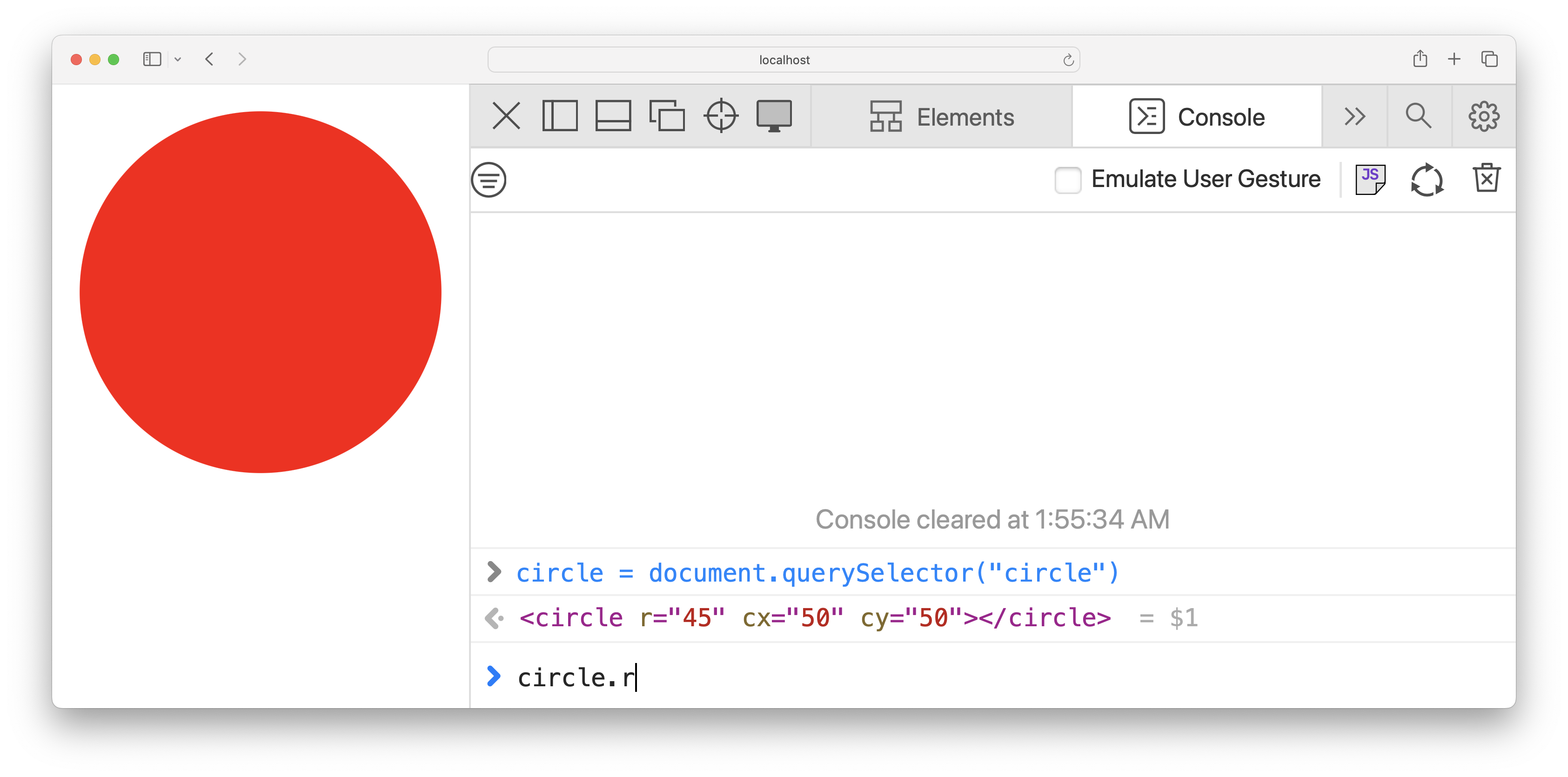
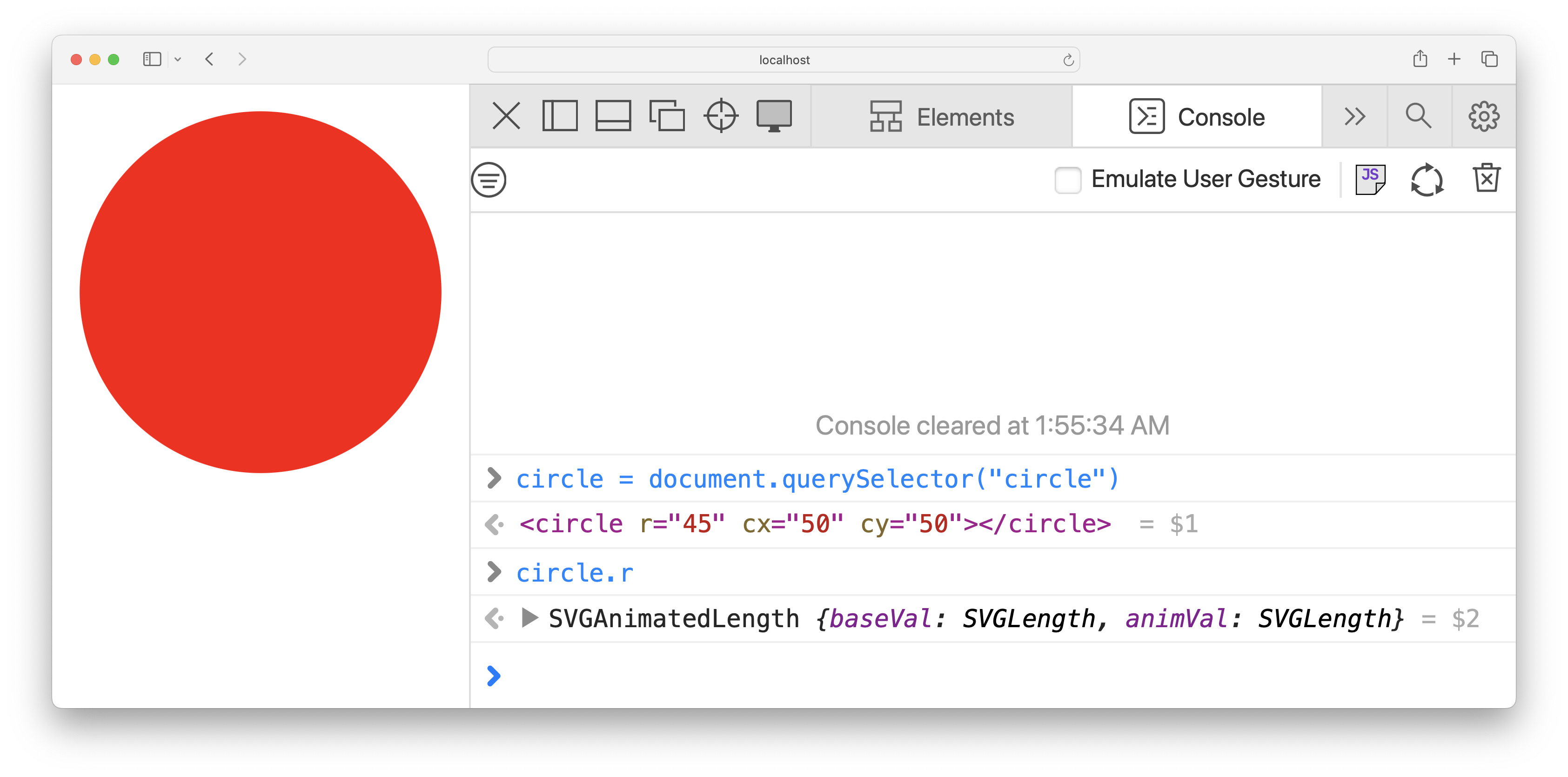
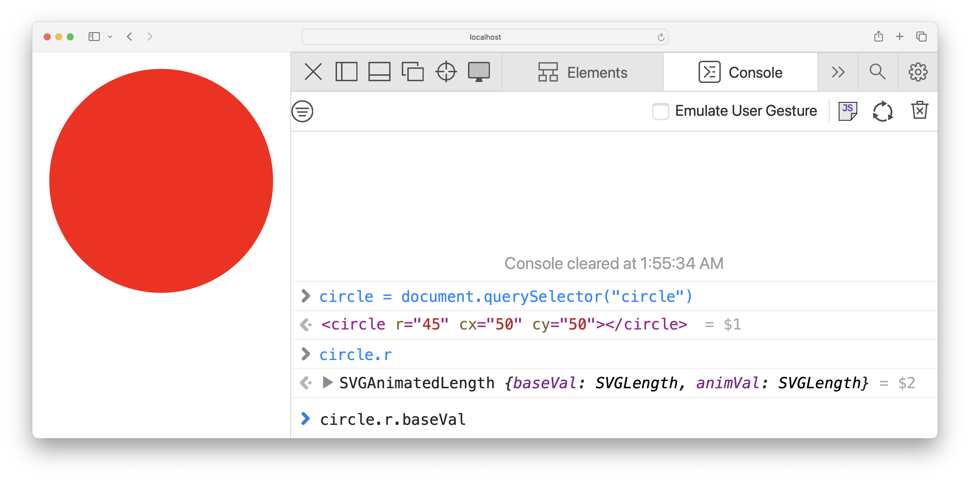
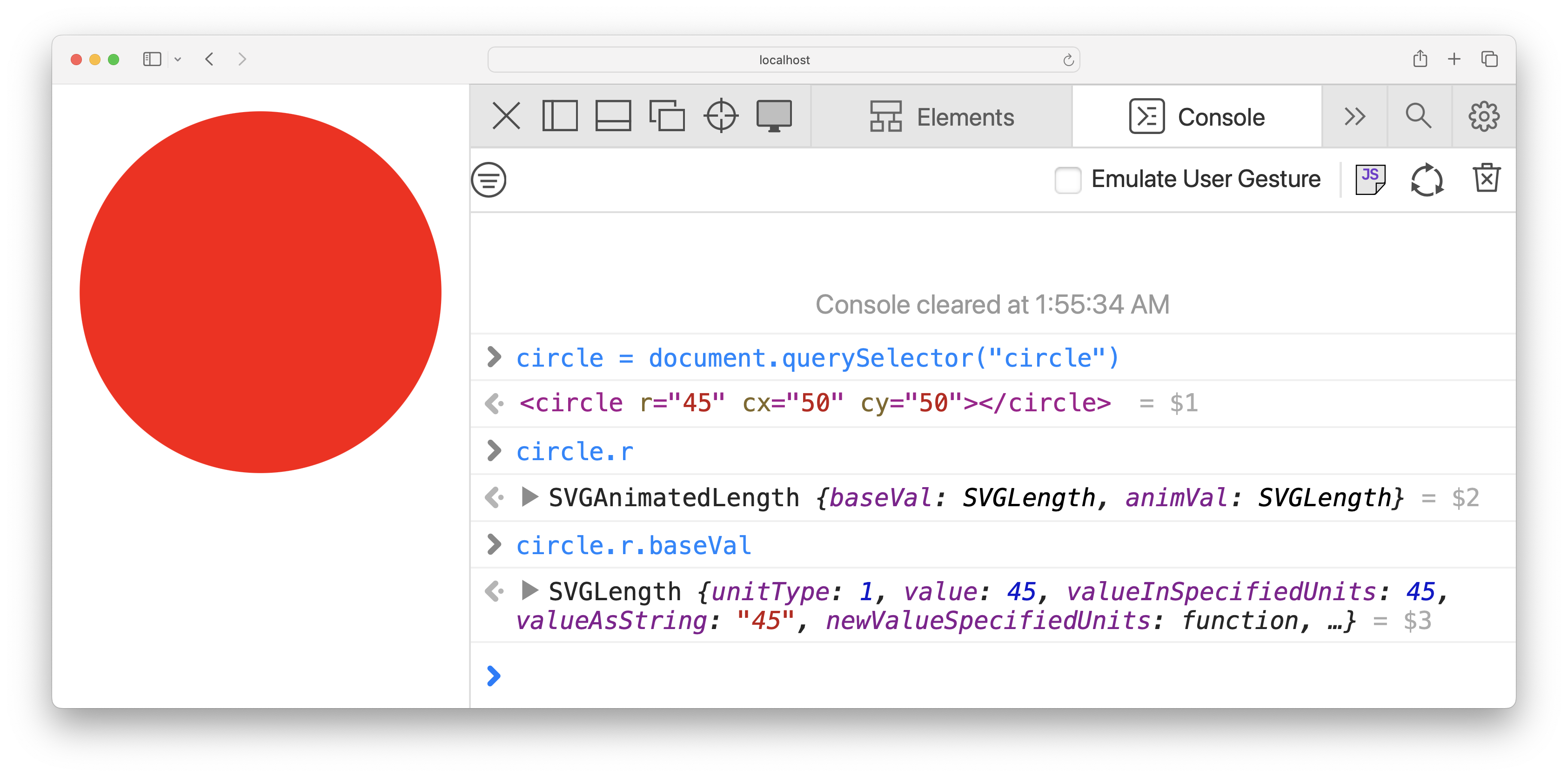
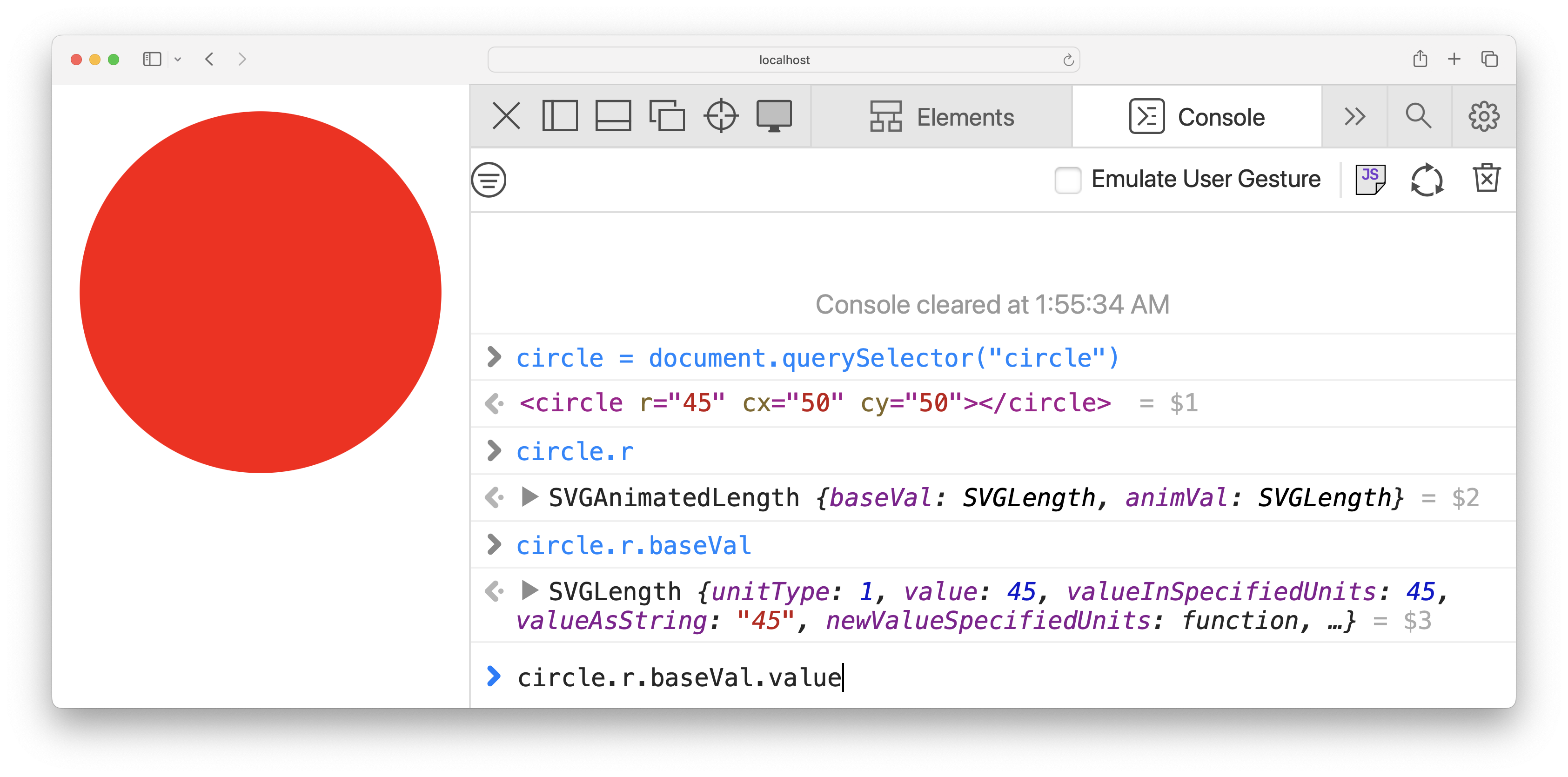
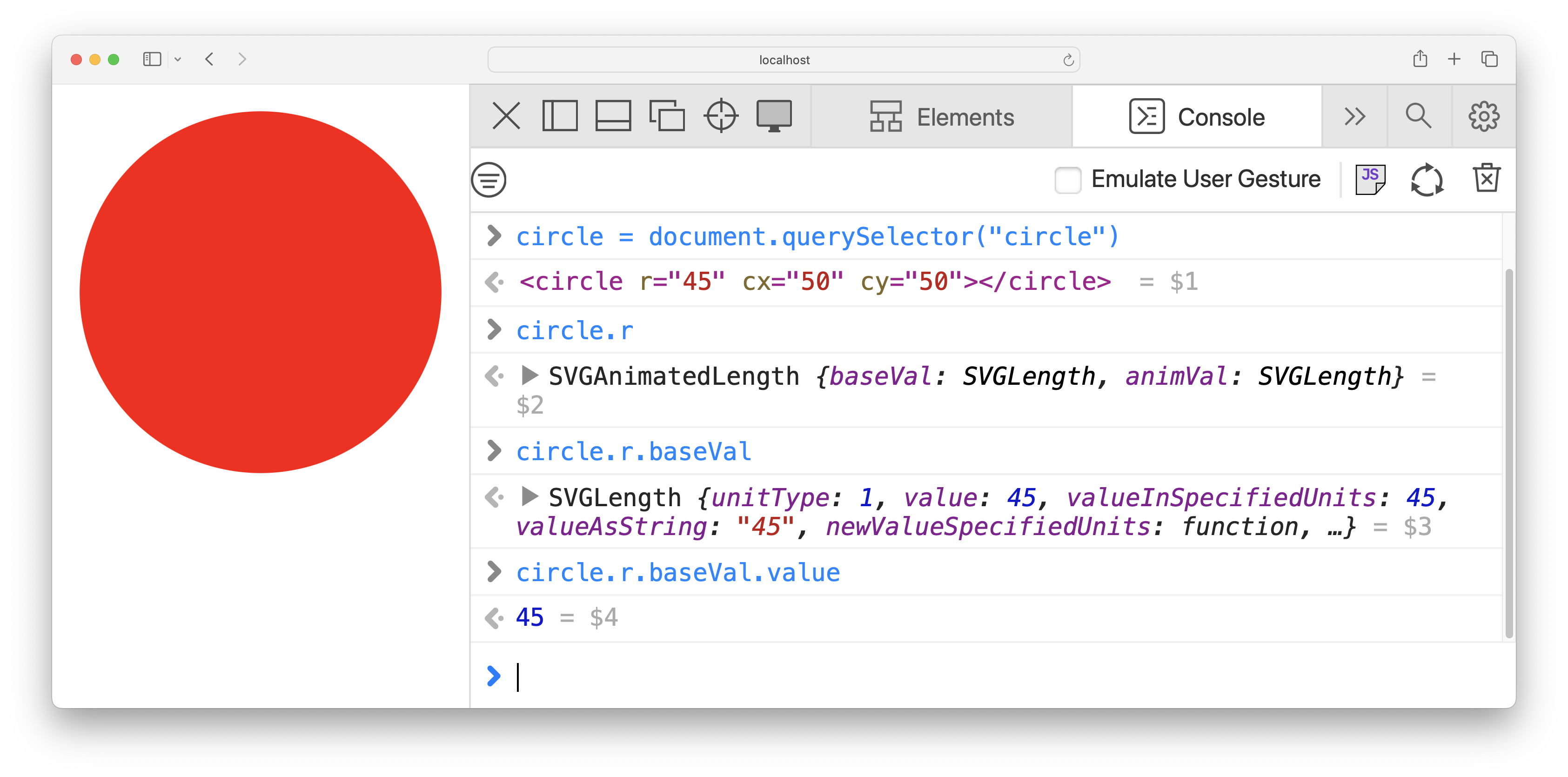
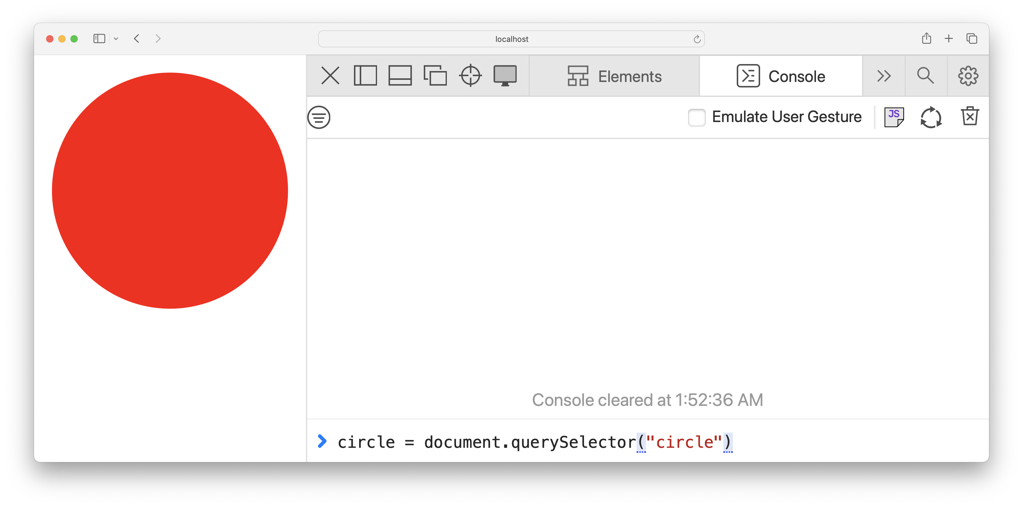
Here’s the most recent API that caused _me_ pain, the SVG DOM. Who here has used the SVG DOM? Lucky you! It’s like the HTML DOM, except worse. Here’s the simplest SVG ever: a circle. We want to read its radius in JS. - It starts all simple, just a good ol’ `document.querySelector()` to get a reference to the circle. Easy peasy.➡️ But it’s all downhill from there.➡️ - Based on the HTML DOM, we’d probably try `circle.r` next, right? Raise your hand if you expect to get `45` back. - _Nope!_ ➡️ You get `SVGAnimatedLength`. But, but, but I have no animations here I hear you say. Doesn’t matter! _What if you did?_ - Anyhow, so we see there’s a `baseVal` and an `animVal`. Since we have no animations, we’ll go for the `baseVal`. ➡️ Raise your hand if you expect to get `45` now. ➡️ - _Nope!_ You get an `SVGLength`, and it has EVERYTHING. Units! Value as a string! Value as a number! Functions to convert between units! But, but, but, all I wanted was a number! Tough shit, you get everything instead. - So then I see `value` in there, let’s go for that. ➡️ Raise your hand if you expect to get 45 now. ➡️ Ok yes, we finally do. 😮‍💨 None of it was _difficult_, but it was _annoying AF_, wasn’t it? So what’s wrong with this API?
“Simple things should be easy, complex things should be possible”
Alan Kay (famous computer scientist)
Portrait of Alan Kay
Alan Kay famously said [read]. It’s considered one of the biggest API design principles. Except it doesn’t _just_ apply to API design, but any well-designed product.
Take Google Calendar. It takes one click to add an event. We can drag an edge to make it shorter or longer, or drag & drop to reschedule it. We can edit its main details from the popup, or click “More Options” and do crazy things like repeat it every third Sunday on a full moon. Simple things are easy, and complex things are possible. This is not an outlier. You will find that **most usability principles apply to API design**, and many API design principles apply to visual interfaces too. APIs are just a different kind of user interface, where **the users are developers and the interaction involves writing code**.

DX

ˈdiː ˈɛks noun

  1. Initialism of “Developer Experience”. Basically User Experience (UX) when the user is a developer and the interaction involves writing code.
This seemed like such a difficult concept, that people could not possibly reuse the same words, nooo. We had to invent a new word that basically means "UX when the interaction involves writing code."
Now picture a a plane with two axes: the horizontal axis being the complexity of the desired task, and the Y axis the UI or API complexity users need to deal with to accomplish it. Alan Kay’s maxim can be visualized as two points on that plane. “Simple things being easy” means there should be a point on the lower left. Complex things being possible means there should be a point _somewhere_ on the far end, the lower down the better, but higher up is ok.

How will people use it?

Pain points, Use cases, usage scenarios, user goals

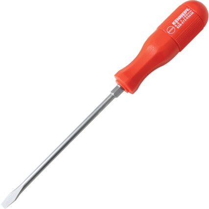
Being aware of user needs is crucial in designing a good UI. It means we can solve actual problems that real people have, rather than expending energy solving imaginary problems we think they have. There are many different words to describe user needs from different angles: pain points, use cases, usage scenarios, user goals. For simplicity, we will stick to "use case": an example of a common, expected task that people will use our UI for. Use cases can be high level, low level, or anywhere in between. For example, one high level use case for a screwdriver is assembling an IKEA cabinet, and a low level use case screwing in a drywall screw.

How will people use it?

Pain points, Use cases, usage scenarios, user goals

Similarly, APIs also have use cases. For example, a high level use case for regular expressions is data validation, and a low level use case is matching repeating digits. We collect use cases throughout the design process: initial use cases help **drive the design**, and later use cases help **validate it** and ensure it does not **[overfit](https://bootcamp.uxdesign.cc/overfitting-and-the-problem-with-use-cases-337d9f4bf4d7)**. You can think of use cases as **the unit tests of API design**: the more diverse they are, the more robust the design.
Now let’s get back to the _use case complexity_ to _UI complexity_ chart. Where would the SVG DOM be on it? I think it would be a flat line: all the complexity of the edge cases is in your face at all times.

Reveal complexity progressively

Ideally, **complexity should be progressively revealed**: there when you need it, tucked away when you don’t.

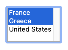
		<select id="country">
			<option value="fr" selected>
				France
			</option>
			<option value="gr">
				Greece
			</option>
			<option value="us">
				United States
			</option>
		</select>
	

		<select id="country" multiple>
			<option value="fr" selected>
				France
			</option>
			<option value="gr">
				Greece
			</option>
			<option value="us">
				United States
			</option>
		</select>


???

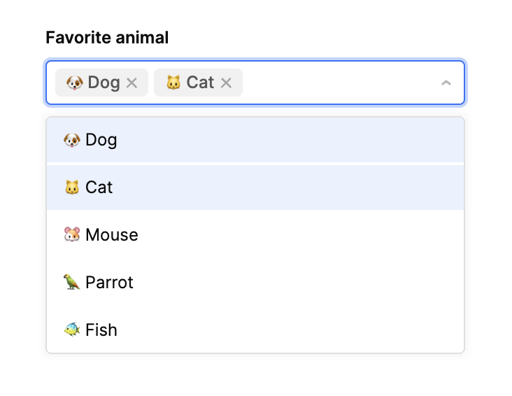
Let’s look at another example, a humble `<select>` menu. Are HTML elements APIs? Of course. Just like your own components. Several issues here. You can add a `multiple` attribute and turn it into a multiselect listbox. But… ➡️ what if you wanted a multiselect _dropdown_? This highlights a common antipattern, which is best explained with an example from the physical world. ---- Now back to the `<select>` element. Lack of orthogonality is not its only issue. It’s certainly quite simple to use! But, it doesn’t do very much. You can use JS to manipulate the options dynamically, but that’s about it.

Orthogonal controls for orthogonal concepts

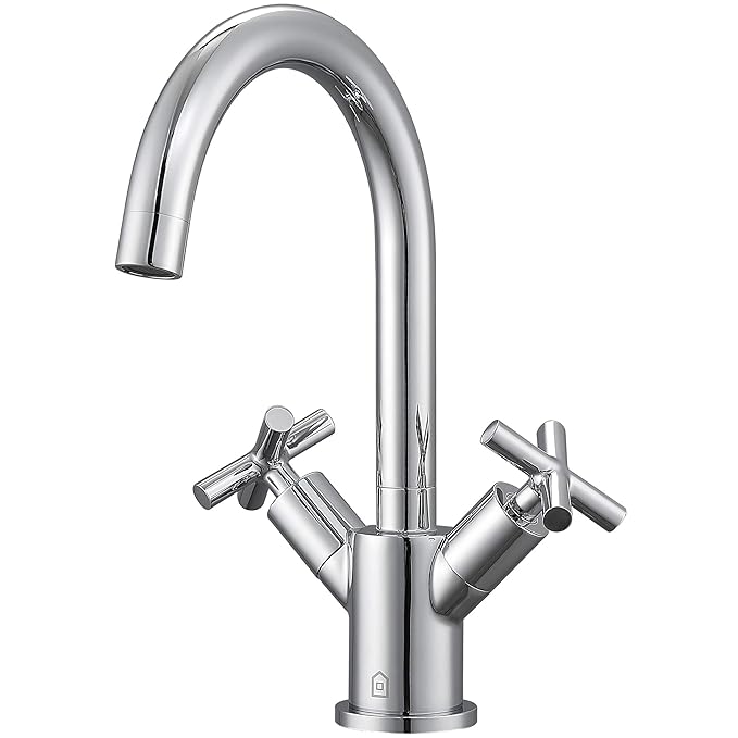
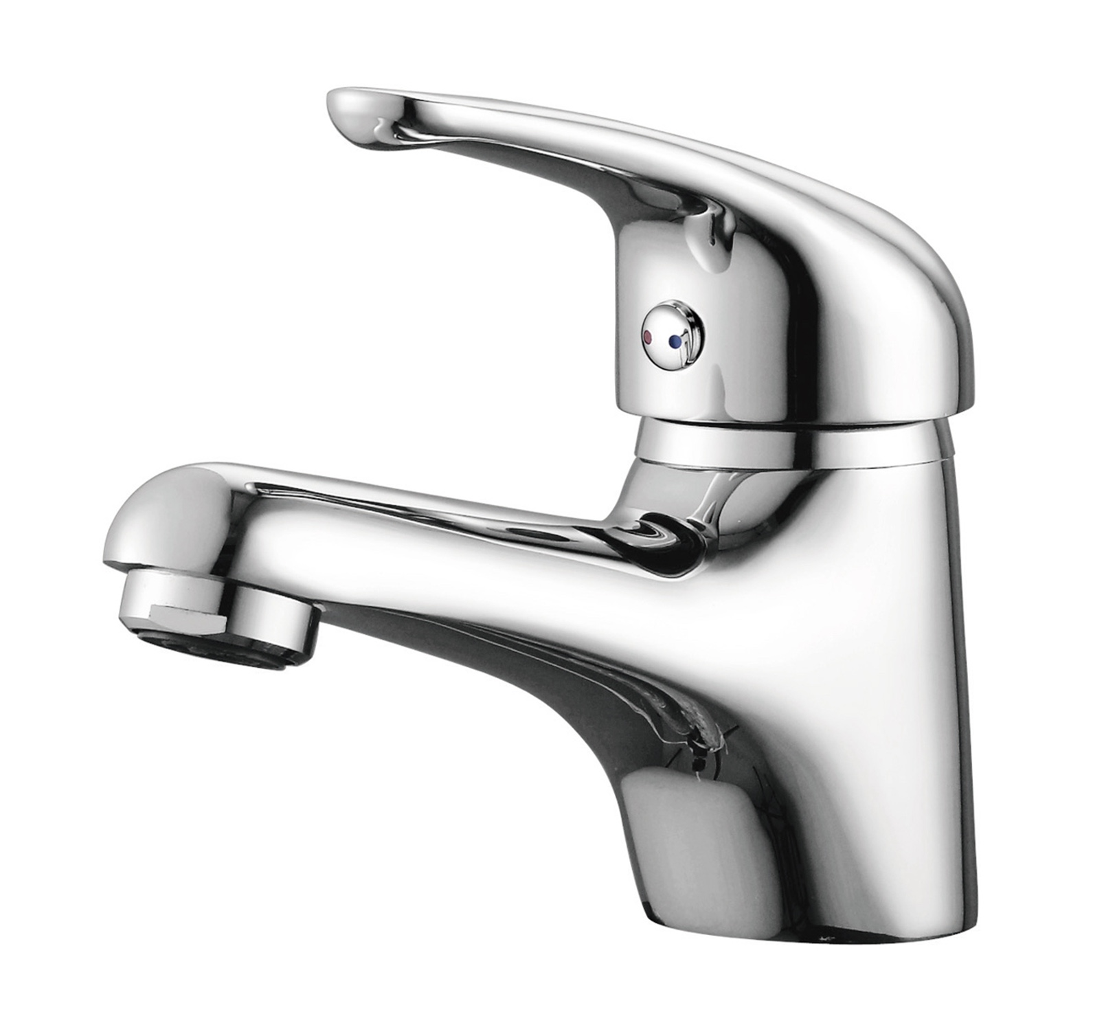
Remember these older faucets that had separate controls for hot and cold water? The **use cases** are clear: 1. adjust the flow of water, and 2. adjust the temperature of water. The **implementation** involves mixing two streams of water: one for hot and one for cold water. The older UI is driven by implementation, rather than user needs, and exposed the internals directly to users, resulting in friction and frustration. Adjusting either the temperature or the flow required a series of adjustments and corrections. Modern faucets are instead designed around the actual user needs, and expose the two concepts separately. The internals are still the same — the faucet just takes care of doing the translation for you. ➡️ It’s usually a good practice to expose orthogonal controls for orthogonal concepts. Examples abound of this going wrong, e.g. CSS positioning is another example. You may decide to *also* expose higher level knobs that tweak multiple things, but the dependencies would be driven by use cases, not implementation convenience.
You can’t style it or add custom content, you can’t add a search box, you can’t allow custom options, you can’t turn it into a multiselect or combo box. All pretty common things that people want to do with it.
Let’s add `<select>` to our chart. It starts at the bottom left, since simple things are easy. It goes up a bit and then just …stops. Even slightly complex things are _not_ possible. No wonder that in most surveys it comes up as both the most hated and the most frequently recreated HTML element! Thankfully, there are recent efforts to fix these issues but until then it remains an excellent example of what _not_ to do when designing components.
<video src="videos/cat.mp4" controls></video>
Now let’s look at another example, the `<video>` element and its corresponding JS API. Simple things are certainly easy: all we need to get a nice sleek toolbar that works well is a single attribute: `controls`. We just slap it on our `<video>` element and bam, we’re done.
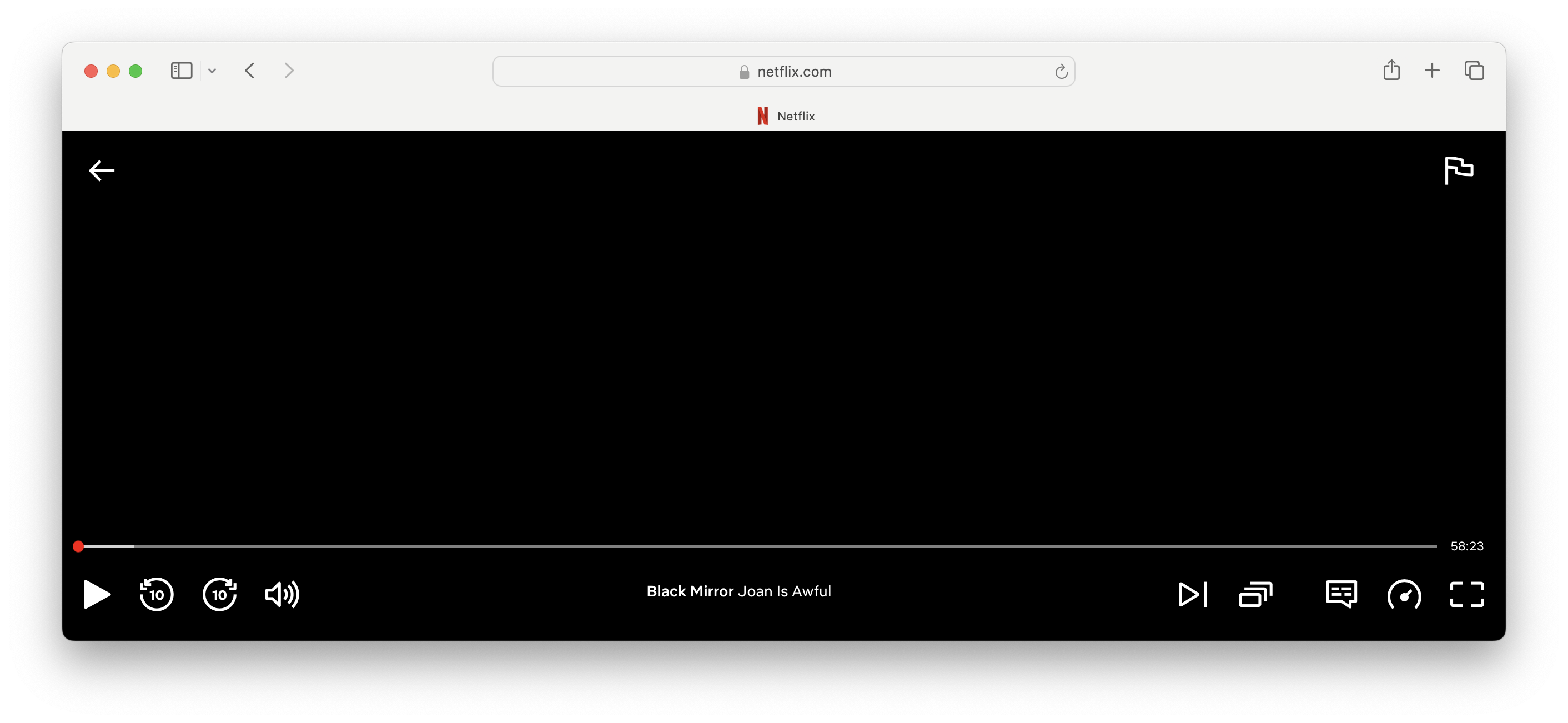
Now let’s suppose use case complexity increases just a tiny bit. Maybe I want to add a selector for subtitles. Or a button to open the video on YouTube. Or key moment indicators. ➡️ Or maybe buttons to jump 10 seconds back or forwards like Netflix. None of these are particularly niche, but the default controls are all-or-nothing: changing anything means reimplementing the whole toolbar from scratch.
<video src="videos/cat.mp4"></video>

			let controls = Object.assign(document.createElement('div'), {
				className: 'video-player'
			});
			video.replaceWith(controls);
			controls.append(video);
			controls.insertAdjacentHTML('beforeend', `<div class="video-controls">
				<div class="toolbar">
					<button class="play-pause" title="Play"><i class="fa-play"></i></button>
					<button class="jump-back"><i class="fa-arrow-rotate-left"></i></button>
					<button class="jump-forward"><i class="fa-arrow-rotate-right"></i></button>
					<input type="range" class="volume" max="1" step="0.01" value="1">
					<button id="fullscreen"><i class="fa-expand"></i></button>
				</div>
				<input type="range" class="progress" step="0.1" value="0">
			</div>`);

			controls.querySelector(".play-pause").addEventListener('click', async function () {
				if (video.paused) {
					await video.play();
					this.title = 'Pause';
					this.firstElementChild.className = "fa-pause";
				}
				else {
					video.pause();
					this.title = 'Play';
					this.firstElementChild.className = "fa-play";
				}
			});
			controls.querySelector('.jump-back').addEventListener('click', function() {
				video.currentTime -= 10;
			});
			controls.querySelector('.jump-forward').addEventListener('click', function() {
				video.currentTime += 10;
			});
			controls.querySelector('.progress').addEventListener('input', function() {
				video.currentTime = this.value / 100 * video.duration;
			});
			controls.querySelector('.volume').addEventListener('input', function() {
				video.volume = this.value;
			});

			video.addEventListener('timeupdate', function() {
				controls.querySelector('.progress').value = this.currentTime / this.duration * 100;
			});
		

			.video-player {
				position: relative;

				.video-controls {
					position: absolute;
					bottom: 0;
					left: 0;
					right: 0;
					padding: .4em .5em;
					display: flex;
					flex-flow: column;
					background-color: rgb(0 0 0 / 20%);
					backdrop-color: blur(5px);

					.toolbar {
						display: flex;
						justify-content: space-between;

						.volume {
							width: 30%;
						}

						button {
							cursor: pointer;
							background-color: #444;
							border: none;
							color: white;
							padding: 5px 10px;
						}
					}

					.progress {
						width: 100%;
					}
				}
			}
		
loc
Just reimplementing the simplest toolbar takes us from 1 line of code to …81! And in practice a lot more. Wouldn’t it be so much better if the default controls were more extensible?
So where would `<video>` be on our chart? Simple things are easy and complex things are possible. But once use case complexity crosses a certain threshold, UI complexity abruptly shoots up. This is called a **usability cliff**, and is common in UIs that make simple things easy and complex things possible by providing two distinct interfaces: a super high level one that caters to the most common use cases, and a super low level one that lets us do whatever but we have to reimplement _everything_ from scratch.

Delightful APIs

Incremental user effort produces incremental value

I used to think Alan Kay’s maxim was the begin-all and end-all of API design. I don’t anymore. Making simple things easy and complex things possible is a good first step, and it’s surprising how many APIs fail it. But these are just the two ends of the spectrum. For truly delightful APIs **all the points in between matter too**.

Delightful APIs

Incremental user effort produces incremental value

You want to be aiming for a smooth curve, where UI complexity increases gradually with use case complexity — the more gradual the better.

Which one is better?

Optimize for the right use cases

Take a look at these two different designs we’re considering for an API. A can do more, but is harder to use. B can only do one thing, but it does it well. Which one is better? Raise your hand if you would pick A. Now raise your hand if you would pick B. Well, both are wrong. How could we pick one without knowing anything about their use cases?! How common are the simple things that are a pain with A? How common are the complex things that B can’t do? ➡️ Now what if I told you that A is `element.compareDocumentPosition()` and B is `element.contains()`? Remember `compareDocumentPosition()`? That’s a fun one. It returns a bitmask of ALL possible relative positions of two nodes. Then you have to do **bitwise operations** with a static `Node` constant to derive anything meaningful from it. But the complex case it was trying to solve is largely imaginary. It’s far, _far_ more common to need to check if an element contains another than to compare source order in arbitrary ways. So `contains()` is the clear winner here, even if it can’t do as much. ➡️ It’s not just about having a smooth curve. It’s also about optimizing for the right use cases. (And not using bitmasks. There is literally no good reason today to ever use bitmasks)

Encapsulate complexity

“Simple” in Kay’s maxim refers to the conceptual complexity of the use case, not the implementation. Simple things are the most common things that people want to do, not things that are necessarily simple to implement. Remember the faucet example: the older faucets were simpler to implement, but made the most common user goals hard. The newer faucets are a little more complex to implement internally, but make the primary use cases simple. This is not a coincidence. It’s a good rule of thumb to opt for internal complexity over external complexity. This may require sacrificing code quality, such as using hacks in production, but it’s a tradeoff worth making.

Encapsulating complexity

The (now defunct) Sanitizer API


			const sanitizer = new Sanitizer({
				allowElements: ['span', 'em', 'strong', 'b', 'i'],
				allowAttributes: {'class': ['*']},
			});
			let nodes = sanitizer.sanitize(untrusted_input);
			container.replaceChildren(nodes);
		
Even though it was removed for other reasons, this was something the [Sanitizer API](https://developer.mozilla.org/en-US/docs/Web/API/HTML_Sanitizer_API) proposal did _really_ well. Its common use case is to take untrusted input and make it safe to stuff into your DOM. This is not simple to implement — it involves some pretty complicated logic and many edge cases. But that’s the use case they (correctly) chose to facilitate by default. To also make complex things possible, they made some of these defaults customizable by allowing users to provide their own allowlists of elements and attributes. UI complexity was revealed progressively, as needed, and did not get in the way when not needed. Perfect! 👌🏼

Priority of Constituencies

“Put the pain on those who can bear it”

User needs
come before the needs of web page authors
which come before the needs of user agent implementors
which come before the needs of specification writers
which come before theoretical purity
A good way to ensure that complexity is encapsulated is to have an agreed upon priority of constituencies. This is what the web platform’s PoC looks like.➡️ End-users above web developers above browser devs above spec writers above theoretical purity. As someone designing APIs for the web platform, this means that _your_ needs as authors are above _my_ needs as a spec writer. The groups involved in defining, implementing, and using a UI vary, but the core idea is to **prioritize users over implementors at every level, and be pragmatic**. This both minimizes collective pain, and assigns the responsibility of dealing with complexity to the most technical group, which brings us to another formulation of this principle: "put the pain on those who can bear it".

No boilerplate

Syntax should not require more than needed to declare intent

Remember the older DOM methods like `removeChild()` or `replaceChild()`? Every operation required a reference to the parent. But the parent could be inferred from the node!! There was zero reason for this, beyond some vague academic ideas about the proper way to do tree operations, and as we’ve just seen, theoretical purity should be at the bottom of priorities. **If it can be computed, it’s your API’s job.** Users should not have to manage multiple sources of truth so they can use your API — just fix your API instead.

No boilerplate

Syntax should not require more than needed to declare intent


			<div class="modal" tabindex="-1">
				<div class="modal-dialog">
					<div class="modal-content">
						<div class="modal-header">
							<h5 class="modal-title">Modal title</h5>
							<button type="button"
							        class="btn-close"
							        data-bs-dismiss="modal"
							        aria-label="Close"></button>
						</div>
						<div class="modal-body">
							<p>Modal body text goes here.</p>
						</div>
						<div class="modal-footer">
							<button type="button" class="btn btn-secondary"
							data-bs-dismiss="modal">Close</button>
						</div>
					</div>
				</div>
			</div>
		

			<wa-dialog closable>
				<h5 slot="label">Modal title</h5>
				<p>Modal body text goes here.</p>
				<wa-button slot="footer"
				           variant="brand"
				           data-dialog="close">
					Close
				</wa-button>
			</wa-dialog>
		
Think, **what is the minimum syntax needed to clearly and unambiguously declare intent**? Is that syntax implementable? If so, implement it. If not, what’s the closest syntax that is? Components did wonders for this. Remember when we had to copy-paste all that to create a dialog?

Layering

No, you don’t have to do it all at once

Yes, a smooth curve requires more resources than a quick fix. But you don’t need to spend all those resources up front and delay shipping. It’s common to ship these APIs in layers, with each release changing the curve for the better. Sometimes that’s the plan from the start, and sometimes it just works out this way, as a response to developer feedback. But where to start from? That depends on the distribution of use cases, and your confidence in your understanding of them.

High level first

If the primary use cases are clustered around a few common patterns we can start with a high level design that covers them well, and ship extension points and lower level primitives later that explain the high level feature. As a rule of thumb, this works well when that high level MVP can cover at least **80%** of use cases.

Low level first

Otherwise, it tends to be safer to start with a lower level primitive that makes complex things possible, and later ship shortcuts and other higher leven abstractions on top of it. This has the benefit that once you deploy it, you can see how people use it and use that knowledge to design a better high level API. The wrong high-level API will not be used at all, whereas an API that is too low-level will be painful, but still usable. One danger with that path is complacency. It’s common to ship a low-level API planning to later ship a higher level one and never do so. This is easy to happen since users will rarely complain about simple things not being easy — they are far more vocal about things not being possible. But their pain is still there. They just tend to blame themselves for it, or resign to it as a part of life and build their own abstractions. There is so much poor UX out there that people are _surprised_ when things work well!

Layering done right

Intl.DateTimeFormat + Date.prototype.toLocaleString()

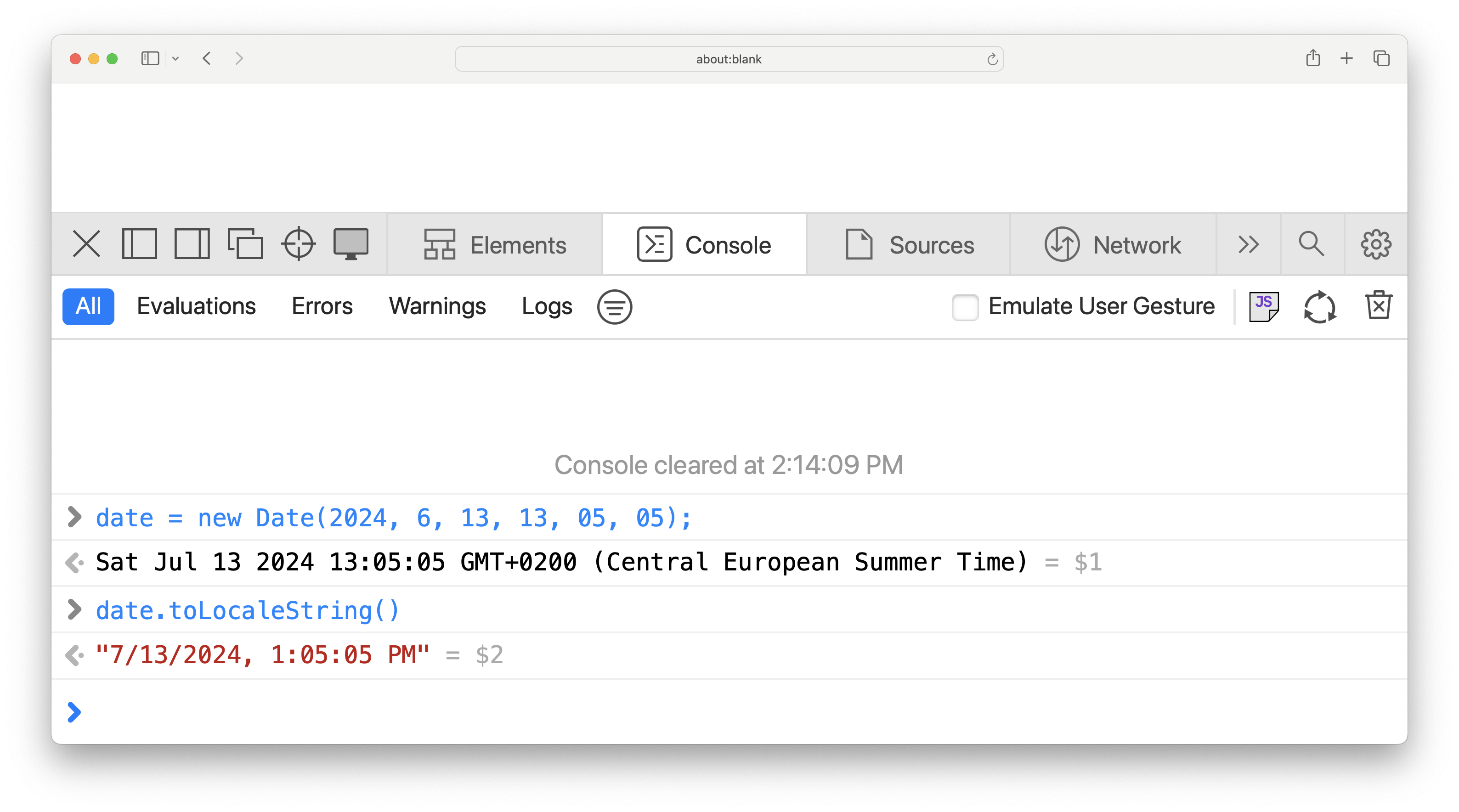
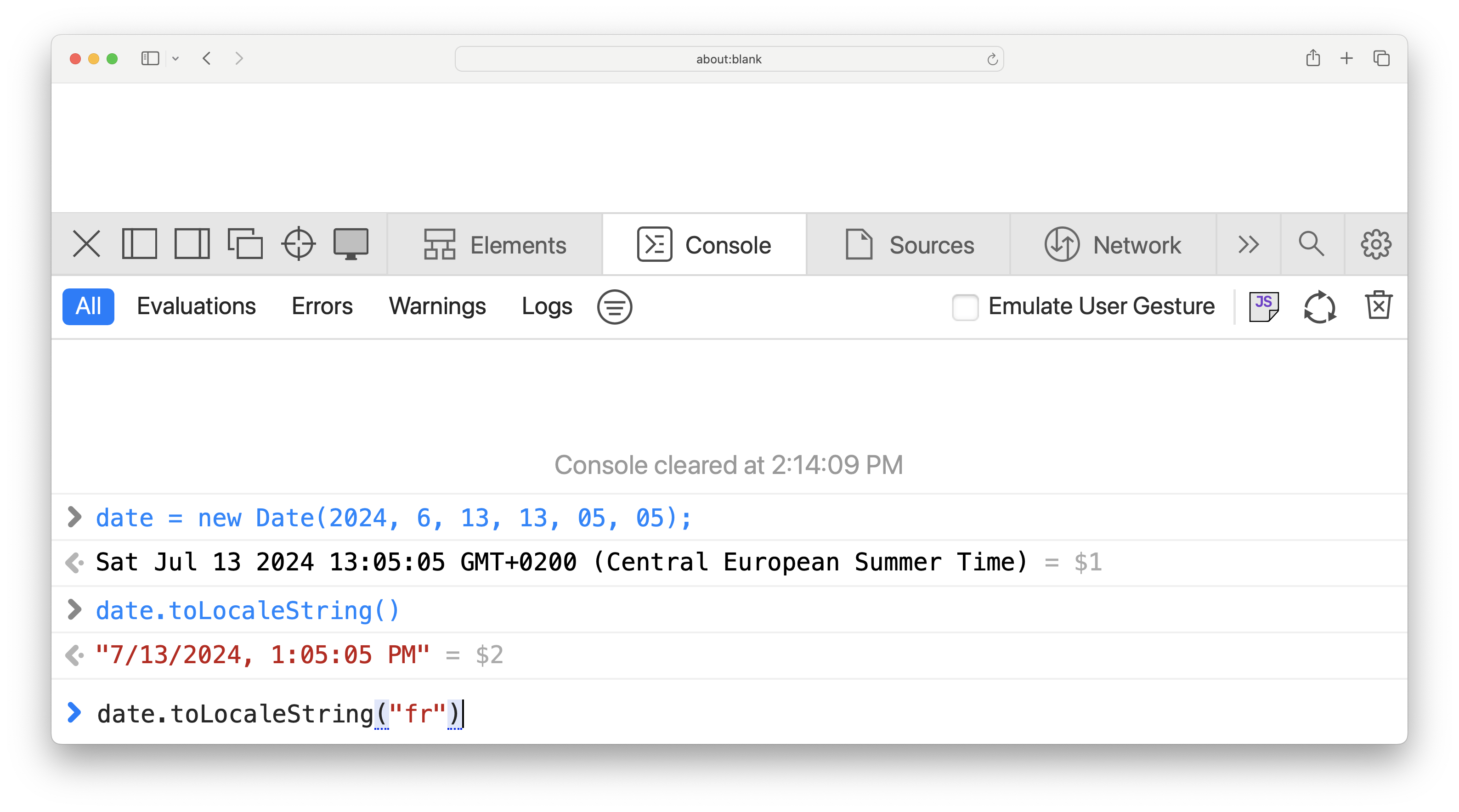
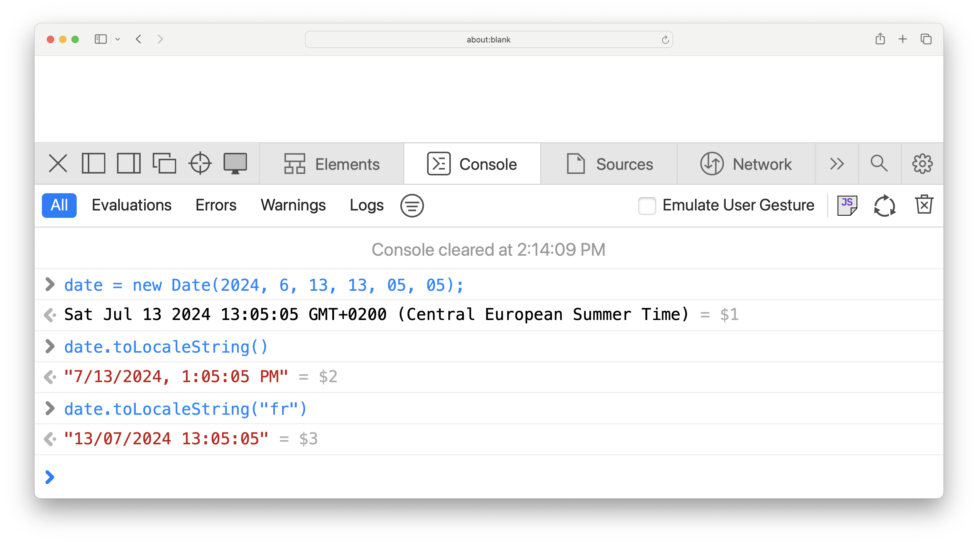
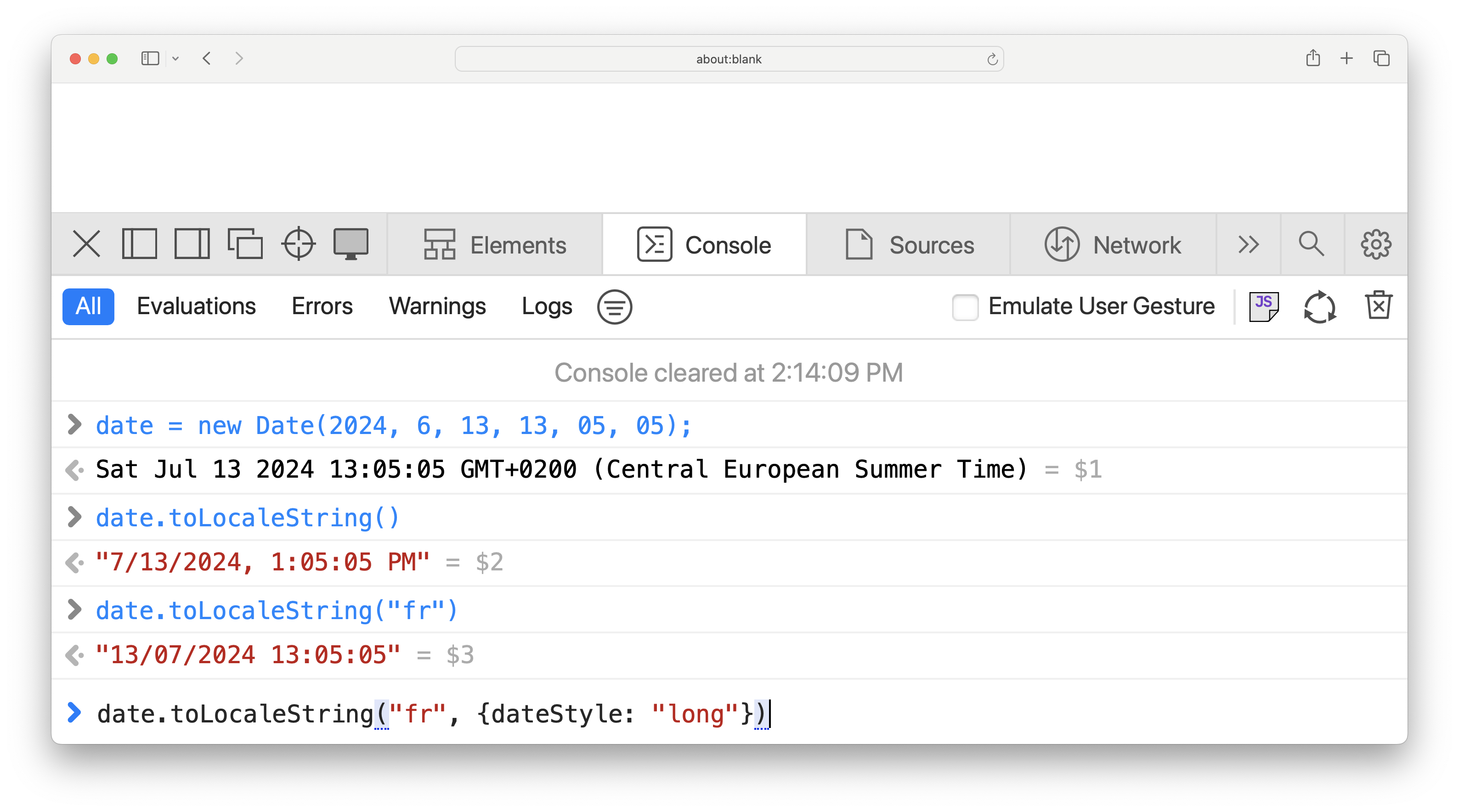
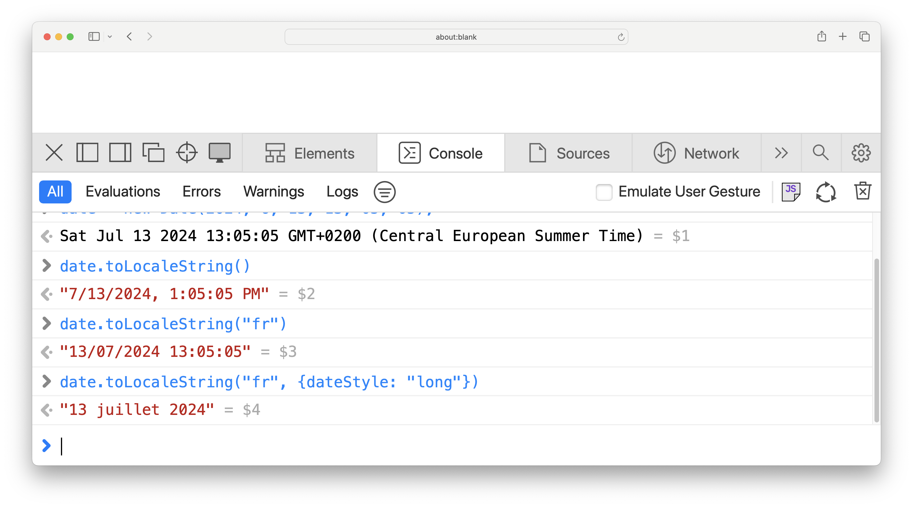
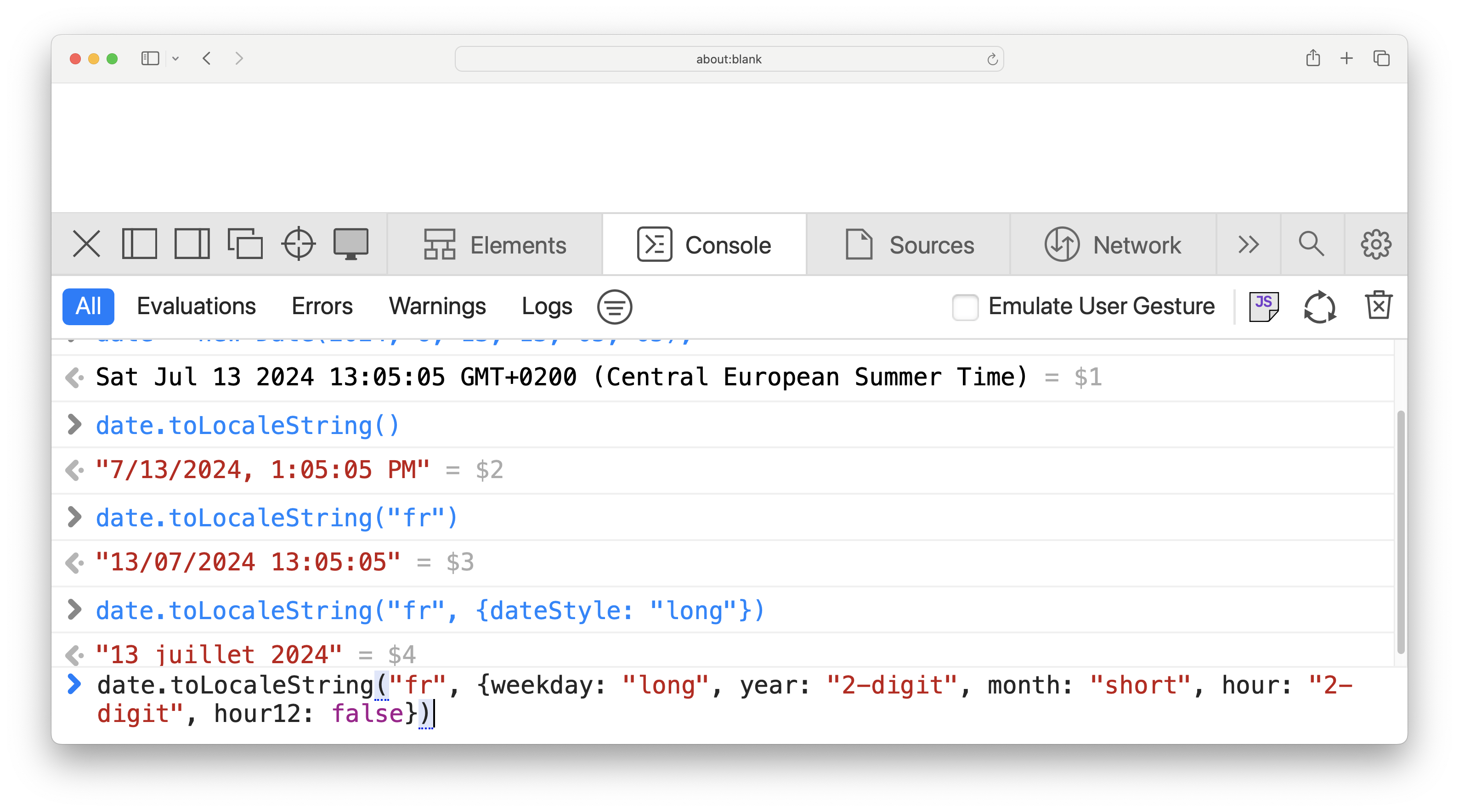
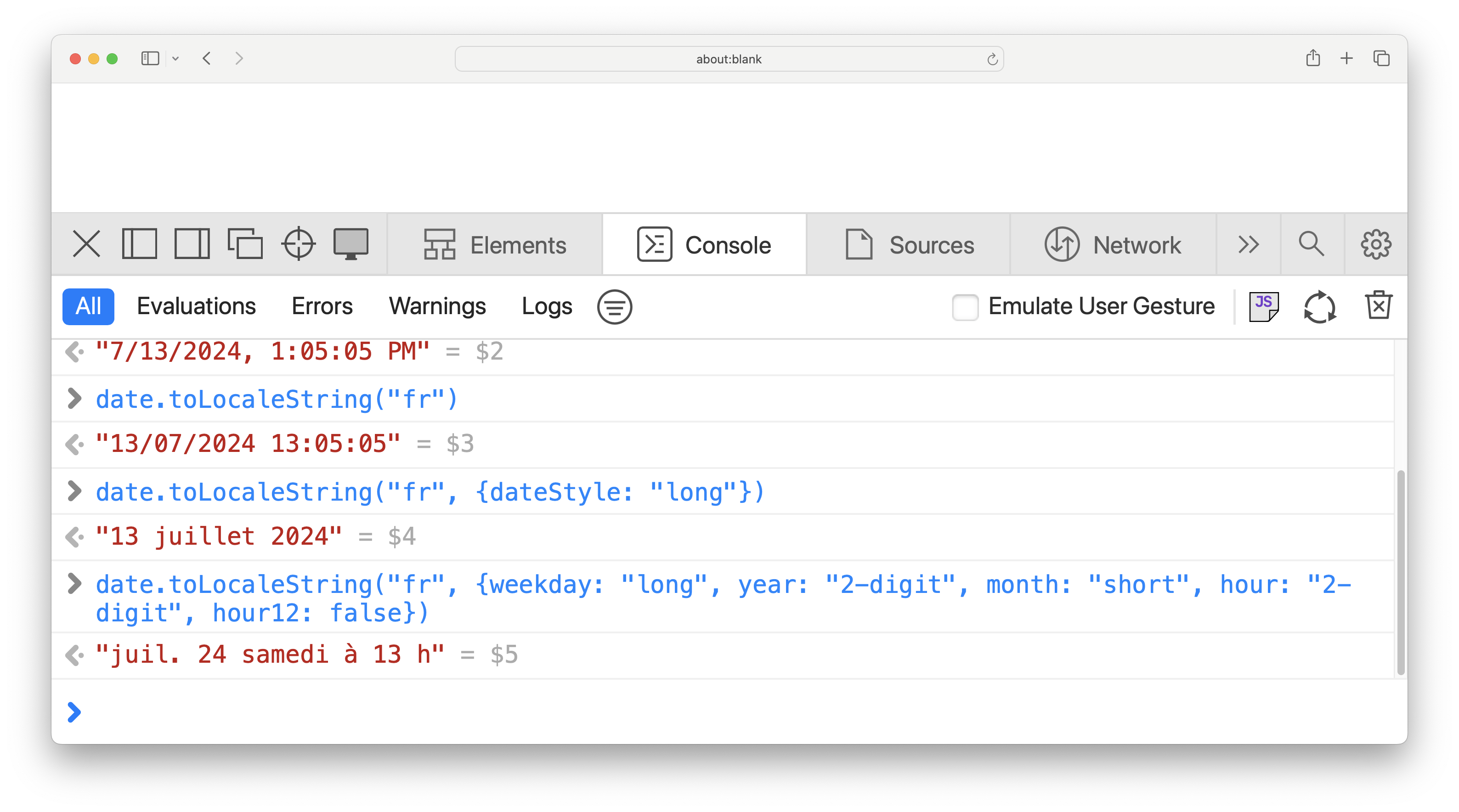
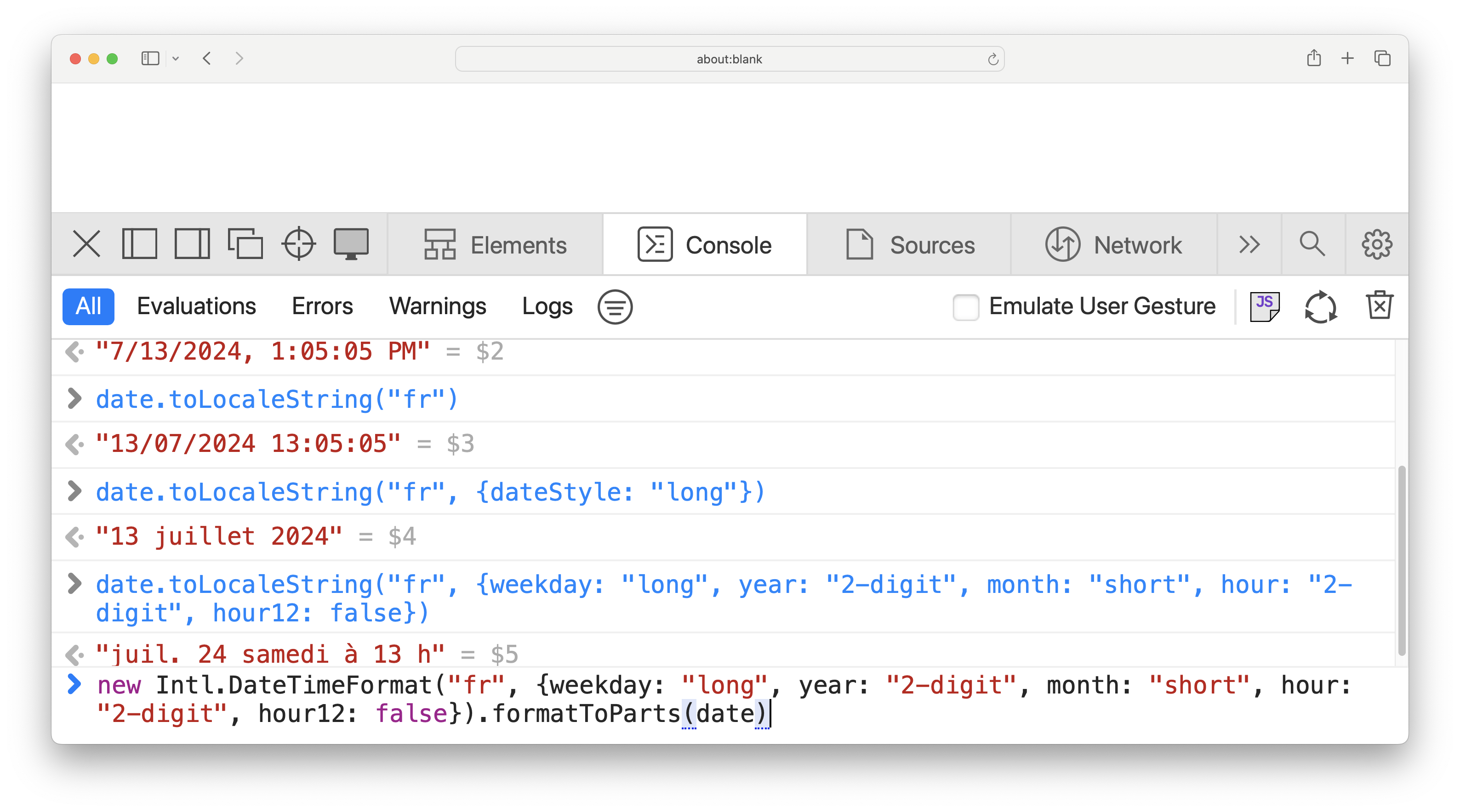
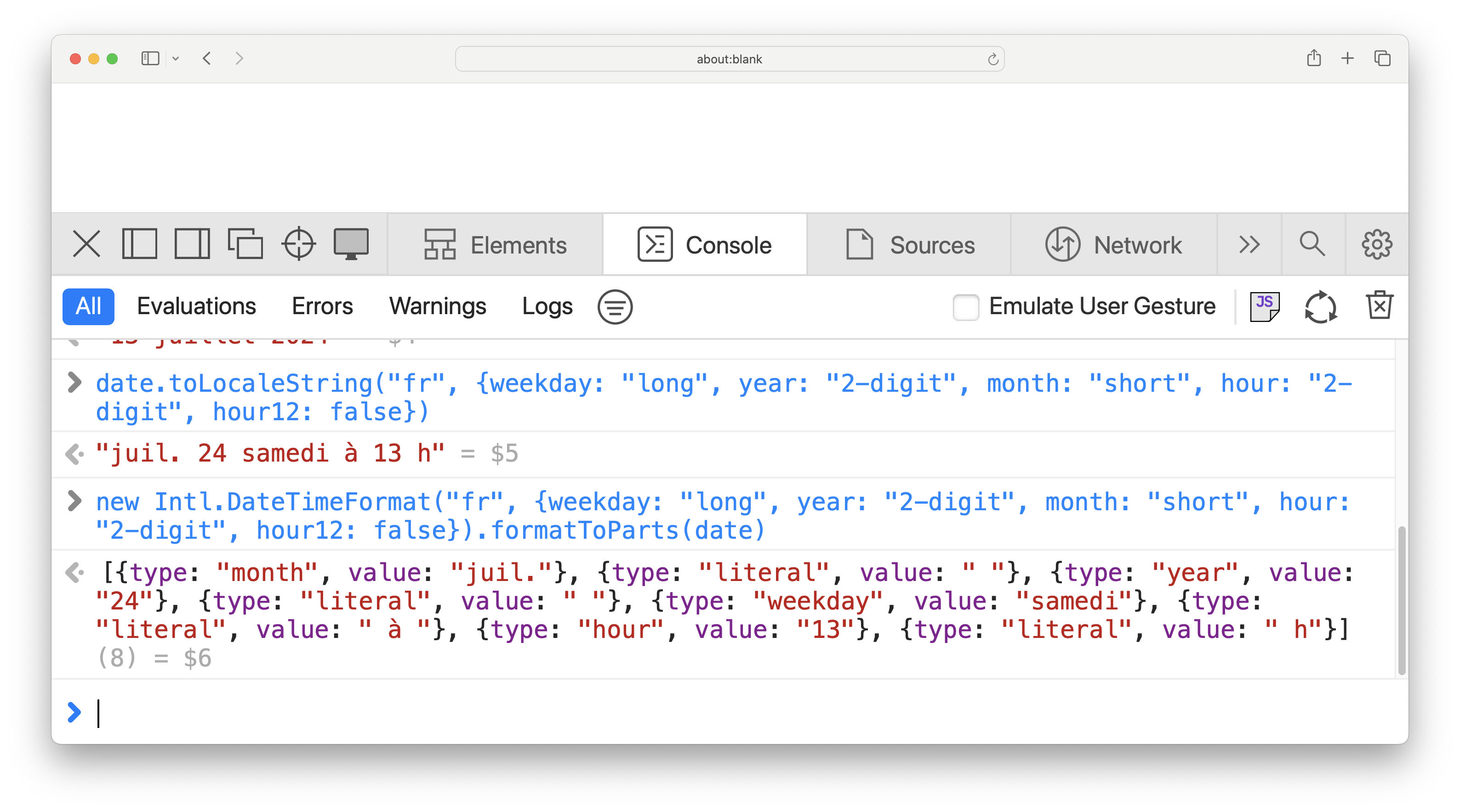
Here’s a disaster turned success story. For years, all we had was this super high level `toLocaleString()` method on `Date` objects, that gave you some formatted datetime in the user’s locale. What was that? Who knows. What format did you get? Who knows. It was so high level it was practically useless. But once the `Intl.DateTimeFormat` API came along, it also enhanced the `toLocaleString()` method, so that you could get progressively more control over the output format. ➡️ You want to just provide a locale? You can do that and it will deal. ➡️ You want to just provide a hint about how long the date should be? You can do that and it will deal. ➡️ You want to control the format and presence of each individual part of the date? You can do that too. ➡️ You want total control, and just want the API to give you a data structure of all the parts? You guessed it, you can do that too. The curve is as smooth as it gets.

User testing

Yes, it works for APIs too.

Most of the high level usability concepts transfer pretty well to API design. Take user testing for example. Dogfooding is great, but it’s not enough. You know too much about your UI. You need to see how people who are not you use what you designed. User testing is surrounded by many misconceptions. One misconception is that it only applies to visual interfaces. The core idea is to get ahold of a few representative users (and for an API these will be developers, but _not_ developers of that API), ask them to perform a few representative tasks, observe what they do, where they succeed, and where they struggle. None of this requires visuals. For user testing to be valuable, it’s important that you **shut up and let the users the talking**. Make it clear upfront that you are testing the design, not them, and that you can answer their questions after, but not during. You can give them documentation, and even a brief tutorial in the beginning, but after that, you should not help them, only encourage them to think out loud and ask non-leading questions.

User testing

No, it’s not some big investment.

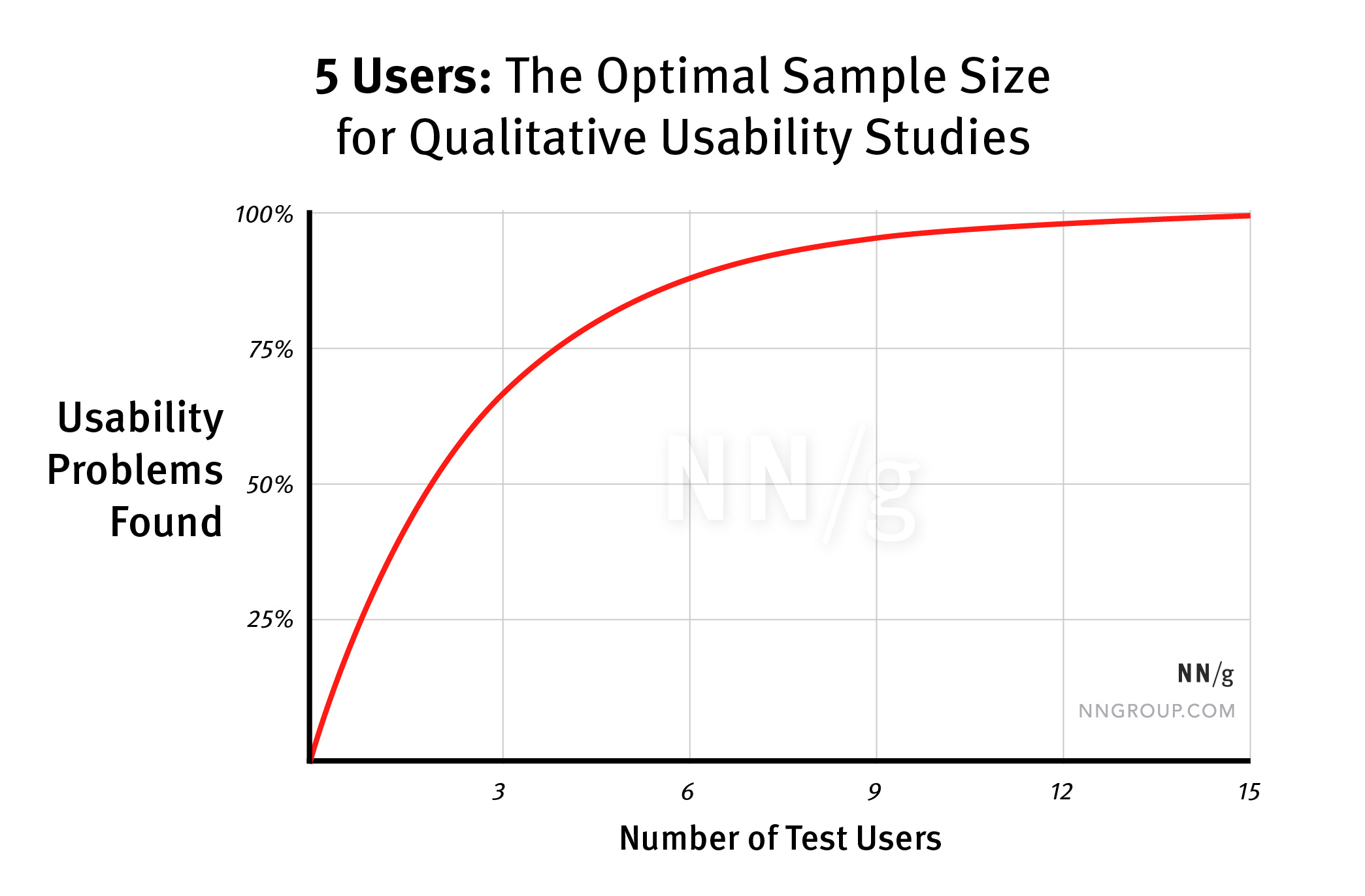
Another misconception is that user testing is time-consuming and expensive. Nope, you need no special equipment, it can be done over Zoom, or live, by sitting next to someone and observing them. You also [only need five users](https://www.nngroup.com/articles/why-you-only-need-to-test-with-5-users/) to uncover 80% of the problems. Even just two users will reveal half of the issues! User testing can also be fantastic in resolving these long bikeshedding debates in a team. Should we call it this or that? Should we use positional arguments or an object literal? Test with both! In most cases, the answer will become clear pretty fast.

It’s not the user’s fault

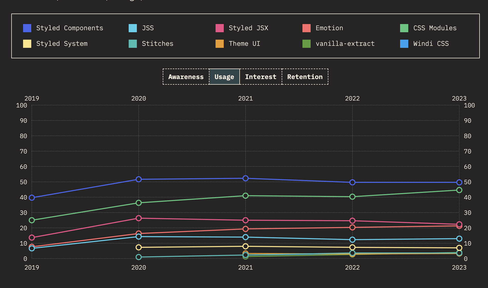
CSS-in-JS usage over time, State of CSS 2023
It’s common to hear devs say that users are doing it wrong. If one user makes a mistake using your UI, it might be their fault. But if several users are making the same mistake, the problem lies with your UI and instead of blaming them, you should focus on fixing it. Take CSS-in-JS for example. So many people think developers using it are _doing it wrong_ and should "simply" learn to use CSS properly. But it’s more productive to figure out _what_ exactly is the need CSS-in-JS is solving, and focus on improving CSS so that it’s less necessary.

Dogfood the hell out of it

  1. First, write demos
  2. Then, the docs
  3. Then, the tests
  4. Only now implement
Dogfooding is not a substitute of user testing. You need both! You user test because you are not the user. You dogfood because it’s impractical to user test every nook and cranny of your API. It’s _crucial_ to **make** things with your API _before_ it ships, and ideally before you even spend time implementing it. ➡️ Write out code for a few demos to see how it _feels_ before you implement anything. ➡️ Then write the docs. ➡️ Then write the tests. ➡️ And only after all that go and actually implement it.

Hone your empathy

But beyond all design principles, the biggest, most important goal is to hone your _empathy_. Simply **caring** about users goes a long way, and matters more than any individual principle. Think about the humans that will use the APIs you’re designing. Their needs, their use cases. Make their lives easier. Reduce their pain.