Raise your hand if you have been confused around the developments in CSS Color in the last few years.
Why do we need all of these? What are they good for? Should I care?
(Show 100% and 0%, then increase CSS and try agian, wtf?!)
Or maybe you tried to use these new color spaces and were baffled at the result.
Why does changing the lightness not seem to work for certain values?
Shouldn't 0 be black and 100 be white? Why are we getting these extremely bright colors instead?
But even beyond CSS, this talk will help you figure out answers to longstanding questions such as "why are printed colors so washed out when they looked lovely on my screen"?
Or why does it seem so impossible to recreate certain colors with a color picker on a screen?
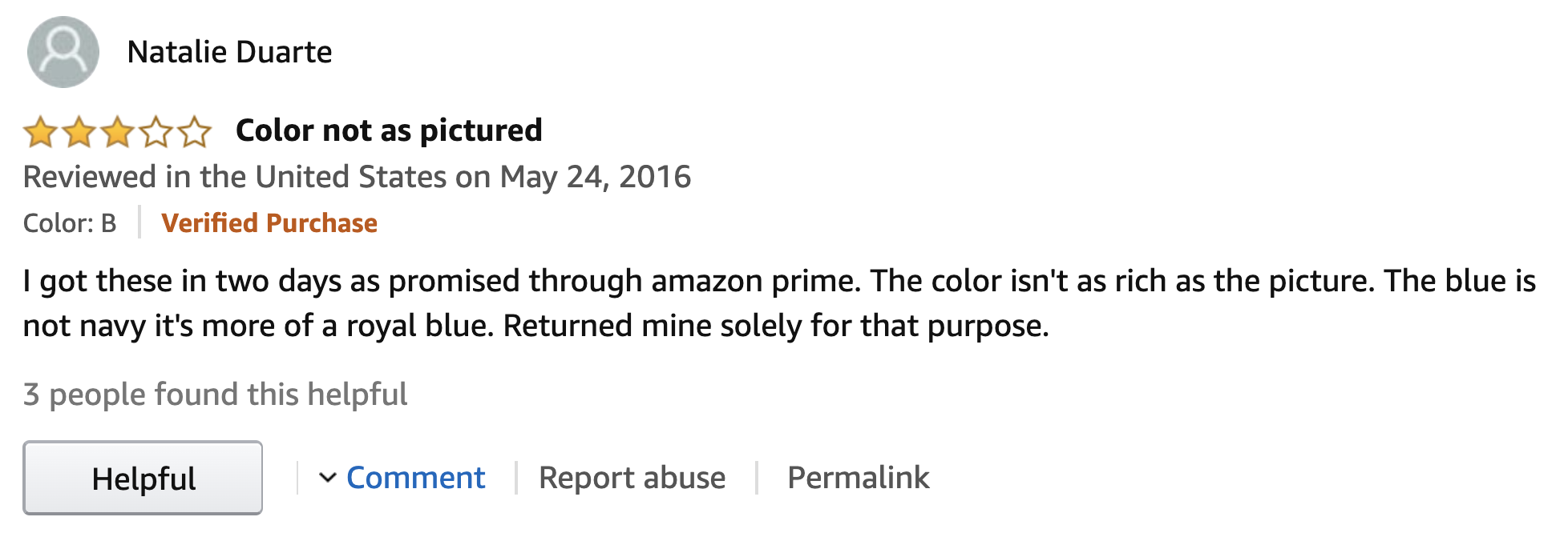
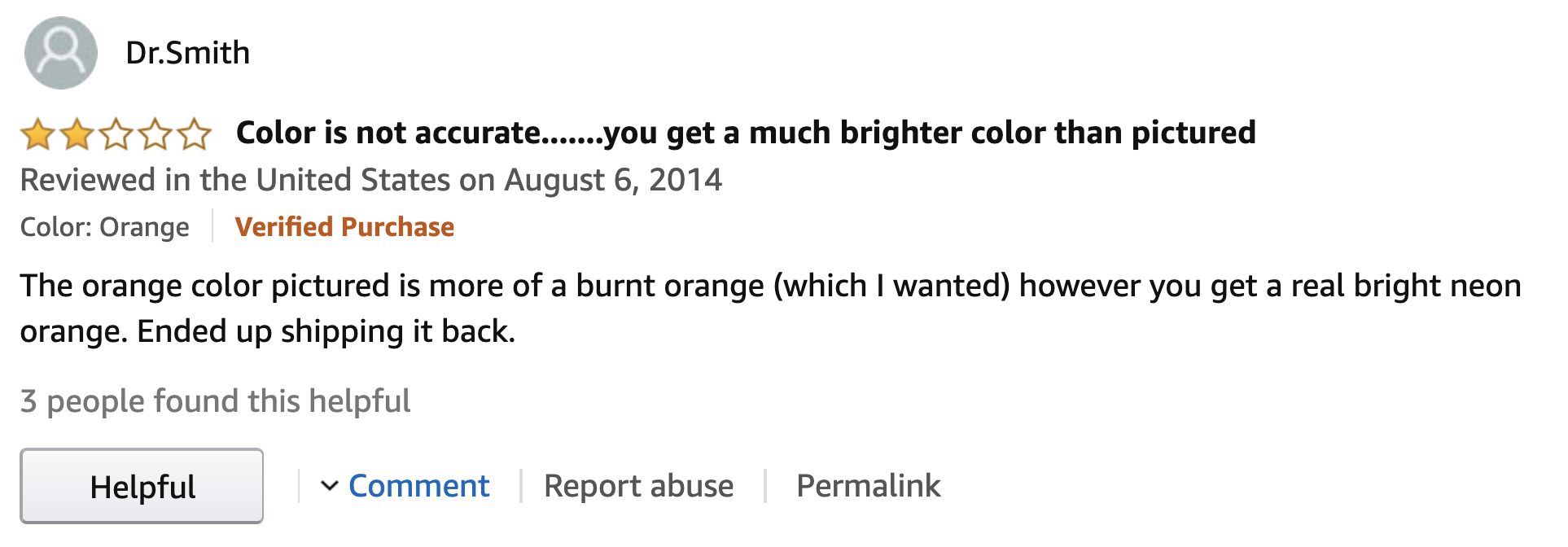
Or why was the t-shirt I bought a different color than what it looked like on Amazon?
The opposite happens too.
This is what this dress looked like on Amazon.
Its real color is way brighter and more vibrant, right?
This talk will explain why this was not their fault — bright turquoise is a notoriously hard color to reproduce on a screen — it's not just fluorescent colors.
RGB
color spaces
(and why they suck)
To understand all of this, we first need to go back to the beginning.
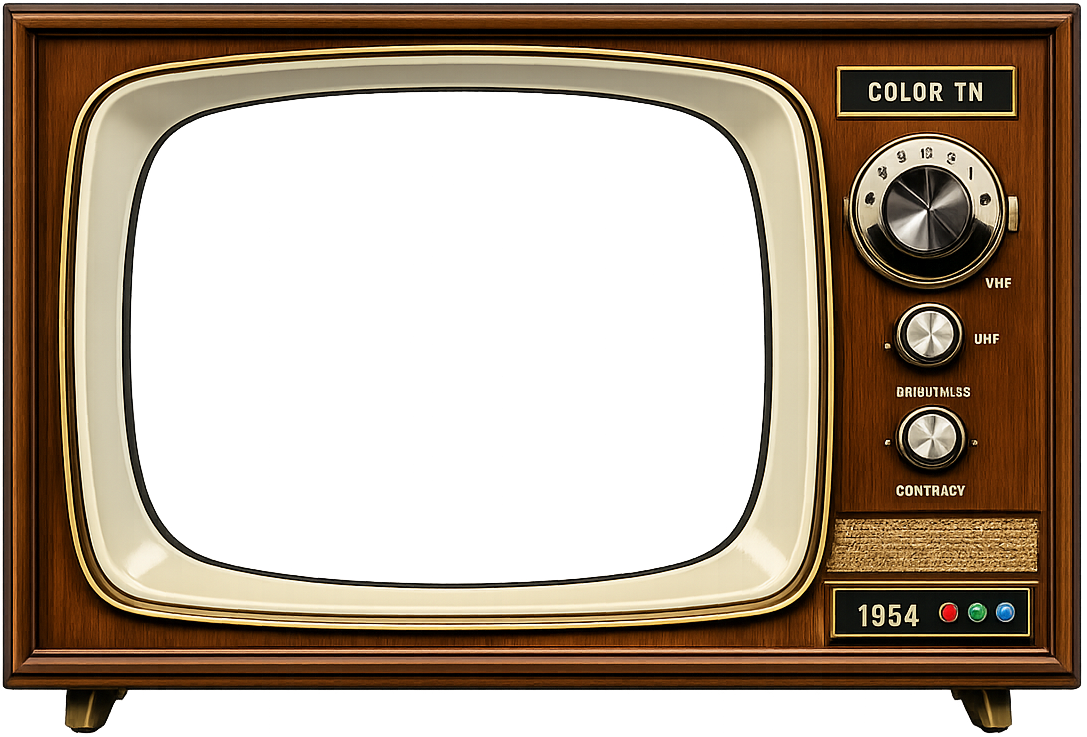
First color CRT (1954)Modern high-end P3 LCD
Red, green and blue is how our computer screens produce color.
Imagine three lightbulbs.
One red, one green, and one blue, each having a dimmer.
This is basically how pixels are made.
And this mechanism has remained largely unchanged since the first color screens in the 50s.
We just got more levels for these dimmers, and their max brightness got higher.
But ultimately, every pixel on your screen is still three teeny tiny dimmable lightbulbs.
Decimal
Binary
Hex
R
255
1111 1111
0xFF
G
0
0000 0000
0x00
B
140
1000 1100
0x8C
= #FF008C
Binary → Hex
0000
0
0001
1
0010
2
0011
3
0100
4
0101
5
0110
6
0111
7
1000
8
1001
9
1010
A
1011
B
1100
C
1101
D
1110
E
1111
F
Now, there are A LOT of these lightbulbs in digital screens.
Hundreds of thousands in early screens, several million in modern ones.
Early computers were not very powerful, so a computation that applied to every single pixel, was very expensive.
So when we needed to specify a color, it had to be as close to the metal as possible:
we'd specify the levels of the dimmers directly.
In fact, we'd go one step further and provide them **directly in binary** — well, in hex which is just a convenient way to write binary numbers!
Remind you of anything?
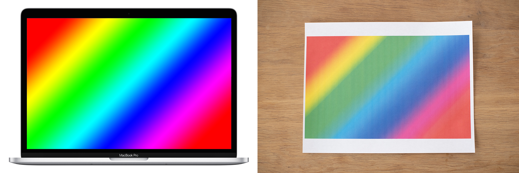
Same coordinates, different colors
Macbook Air 2013Macbook Pro 2026
But usability around color authoring and manipulation is not the only problem with specifying colors through raw subpixel intensities.
As different screens have subpixels with different characteristics, throwing raw coordinates at the screen means different things in different devices.
Many people think this only applies to the brighter colors, but it affects the entire color space — every color looks different.
Standardized RGB spaces to the rescue!
Macbook Air 2013
60% of sRGB gamut, 8 bits/channel
Macbook Pro 2026
P3 gamut, 10 bits/channel
R
G
B
R
G
B
Device RGB (raw)
255
0
102
1023
0
408
Device RGB
1
0
0.4
1
0
0.4
sRGB
0.9124
0.27551
0.50037
1.093
-0.2267
-0.1501
Display P3
0.8428
0.32568
0.49946
1
0
0.4
Rec.2020
0.77306
0.40651
0.52267
0.89202
0.2807
0.42666
Instead of throwing raw RGB values at the screen, we would interpret them based on a particular, predefined RGB space and the screen would do the translation to its own native RGB coordinates internally.
Instead of being tied to hardware, these color spaces typically use 0-1 ranges and colors outside their gamut have at least one component outside that range.
For example, this P3 magenta is outside the sRGB gamut so all three of its components are outside 0-1.
All legacy CSS colors are in sRGB
red is sRGB red, not your screen’s brightest red
Same with #ff0000
Same with rgb(255 0 0) or rgb(100% 0% 0%)
Yup, hsl(0 100% 50%) too
Sorry HWB, we forgot about you again. Yes, hwb(0 0 0) too!
Color gamut
Range of displayable colors
Depends on the primaries (red, green, blue) so often shown as a triangle on the spectral locus
All RGB spaces (device-dependent and standardized) have one
If any component is outside [0,1] = out of gamut color
It’s all about that gamut
’bout that gamut
’bout that gamut
such trouble 🎵
So what happens if we try to render an out of gamut color?
→
ClippedMapped
Guess which one browsers do?
Perceptual uniformity
This is why RGB is a poor choice for gradient interpolation
Usability
RGB is efficient, but *hard* to manipulate by humans or reason about.
These hex codes became opaque mystery meat tokens to copy and paste.
Universal, but indecipherable except to the most initiated.
As often happens, the closer a UI is to the machine, the farther it is from humans.
rgb(62.5% 45.8% 37.5%)
Light muted brownDark beigeLight brown
About 60% red, a little less green and even less blue— No-one, ever
Let’s try this little experiment.
Try to describe this color to the person next to you.
Suppose you wanted to explain to your partner what color [something] you wanted them to buy.
When we talk about colors, we usually talk about them in terms of a pure hue and some modifiers like light, dark, bright, muted, grayish, greenish etc.
Studies disagree on the exact hues and modifiers, but they all find the same general approach.
Polar color spaces
Polar color spaces consist of a hue angle plus two components that control ligthness and chroma/saturation.
They differ in their characteristics, but all share the goal of improving human usability of an otherwise rectangular color space.
HSL
Fast to compute from RGB but…
hsl(60 100% 50%)
hsl(240 100% 50%)
🤔🤔🤔
Perceptually uniform color spaces
Lab, OKLab, LCH, OKLCH, …
Coordinate distance = perceptual distance
Polar coords mean the same thing across the space
Polar coords are orthogonal
Why?
Interpolation (gradients! transitions!)
Dynamic palettes/ramps
Other dynamic computations (e.g. contrasting colors)
Some people like to call me an alert, or an admonition.
I’m chill either way.
				.callout {
					--color-bg: oklch(from var(--accent-color) var(--l-95) c h);
					--color-border: oklch(from var(--accent-color) var(--l-80) c h);
					--color-icon: oklch(from var(--accent-color) clamp(var(--l-30), l, clamp(var(--l-70))) c h);
					--color-heading: oklch(from var(--accent-color) var(--l-30) c h);
					--color-text: oklch(from var(--accent-color) var(--l-10) c h);
				}
Callouts (aka admonitions, alerts, etc) are such a great example for design systems color use cases, because they use many different color tokens, and they have so many variations that their CSS invites combinatorial explosion.
Unfortunately, the result left a lot to be desired.
Why?
Why didn't it work???
The question haunted me.
It became an obsession.
I built a website to analyze designer crafted color palettes, trying to find patterns.
I noticed that chroma was never constant throughout the scale, it dropped dramatically, especially for the lighter colors.
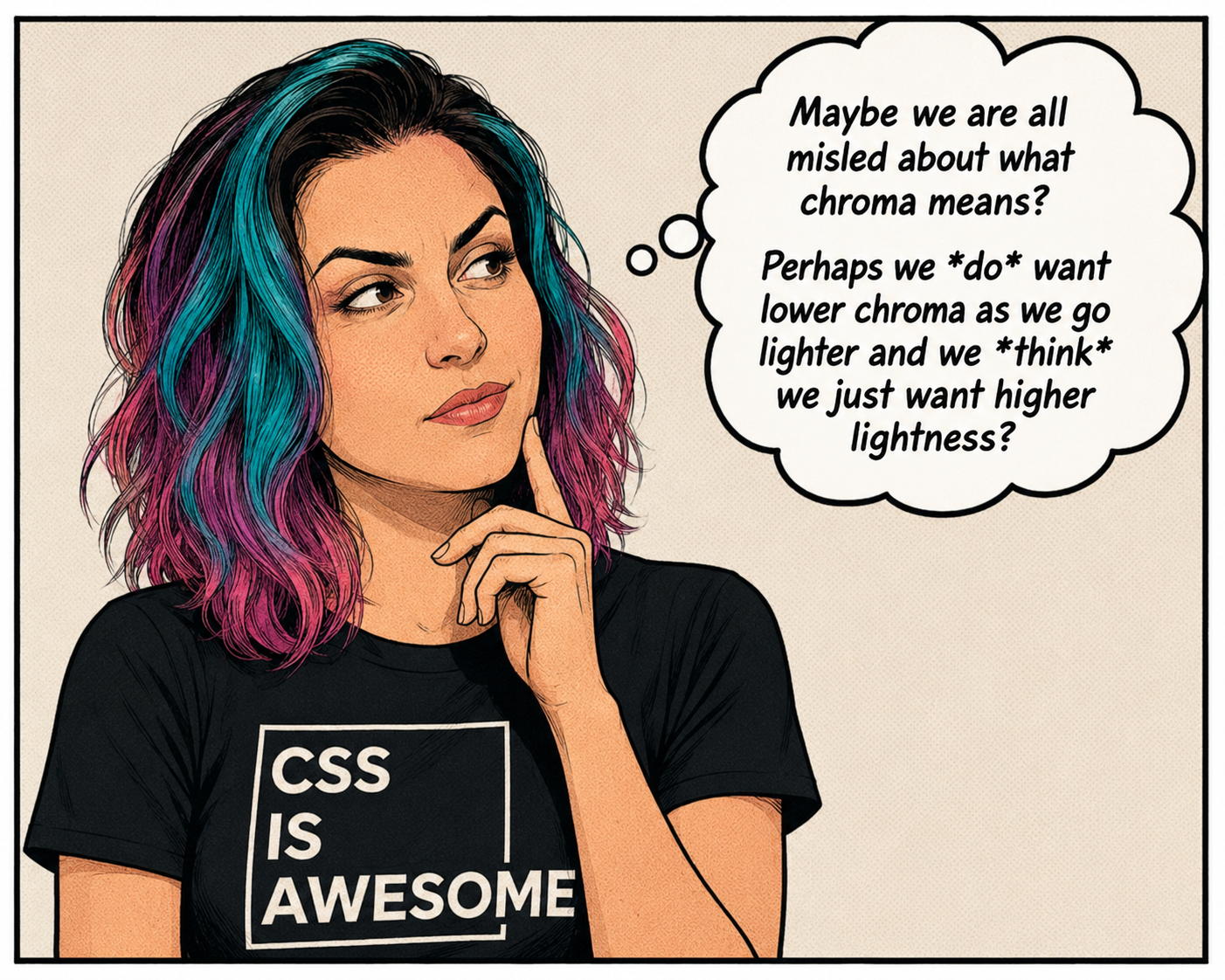
I gaslit myself into thinking we were all asking for the wrong thing.
That lighter tints fundamentally need a smaller chroma, and I just had to find the right formula to get close to a designer-crafted color scale.
So I started looking.
Key color
90
80
70
60
50
40
30
20
10
People often create dynamic scales by mixing with white or black.
The problem with this is that you’re desaturating at the same time as darkening/lightening,
and you have no control over it.
The resulting tints are often washed out.
Also, if we naively mix a predefined amount we get no guarantees about each tint except relative to its key color.
It’s the HSL problem all over again.
Early experiments mixing the two
People often create dynamic scales by mixing with white or black.
The problem with this is that you’re desaturating at the same time as darkening/lightening,
and you have no control over it.
The resulting tints are often washed out.
Also, if we naively mix a predefined amount we get no guarantees about each tint except relative to its key color.
It’s the HSL problem all over again.
One day, it dawned on me.
I was playing with this color picker component I've made when I noticed that when the color got ligther, it was always out of gamut — not just P3, but any reasonable gamut.
So I made another app to explore this hypothesis further.
Turns out that indeed — the lighter or darker you go, the smaller the gamut gets, down to a single point at 0 and 1.
It wasn't that we didn’t know what we wanted.
It was that we were not getting the color we asked for.
Indeed, look here how close just gamut mapping gets us!
It's a pretty acceptable result upfront.
And with a little tweaking, we'd _be_ there.
There was only one problem.
Browsers did not implement gamut mapping.
_But what if we could implement it ourselves?_
Out of gamut is the Wild West
No perceptual uniformity*
No device independence*
No orthogonality*
* even in spaces that generally have these properties
Implementing gamut mapping in CSS?!
There is always a chroma that brings the color in gamut
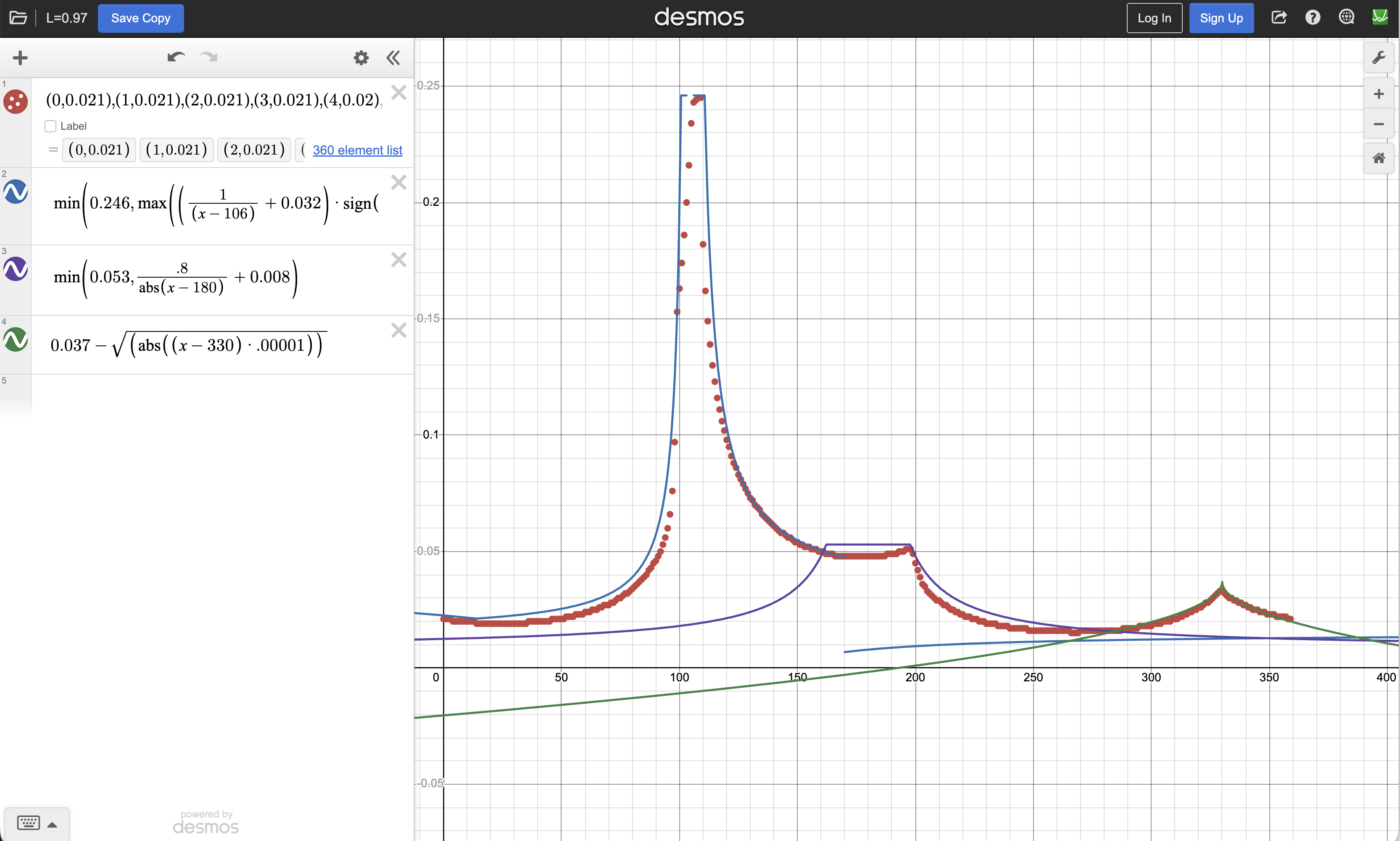
I think this is the closest CSS ever got me to losing my mind.
This is a real formula from one of my attempts:
basically trying to fit the gamut edge curve numerically via a RCS formula.
Do NOT try this at home.
iterations
Callout
--set-l: .97 c h;--clamp-s: h clamp(0, s, 100) l;--color: {{ color }};--color-90-{{i}}: oklch(from var(--color{{ i-1 ? '-90-' + (i-1) + '-hsl' : '' }}) var(--set-l));
--color-90-{{i}}-hsl: hsl(from var(--color-90-{{i}}) var(--clamp-s));
--color-90: oklch(from var(--color{{ n ? `-90-${n}-hsl` : '' }}) var(--set-l));
iterations
--color-lh: oklch(from var(--color) l none h);--clamp-s: h clamp(0, s, 100) l;--color: {{ color }};
--color-{{i}}-hsl: hsl(from var(--color{{ i-1 ? '-' + (i-1) : '' }}) var(--clamp-s));
--color-{{ i < n ? i : 'mapped' }}: color-mix(in oklch, var(--color-{{i}}-hsl) 0%, var(--color-lh));
Relative color syntax with 2 colors?
			--color: oklch(
				from var(--color-1) var(--color-2)
				l c2 h
			);
`none` was originally invented to represent the missing hues in grayscale colors.
none is awesome
--color: oklch(0.6 0.3 350);
--img: linear-gradient(to right in oklab,
	var(--color), oklab(0.5 0 0));
--img2: linear-gradient(to right in oklab,
	var(--color), oklab(0.5 none none));
none is awesome
--color: oklch(0.6 0.3 350);
--color2: oklch(0.8 0.2 80 / 50%);
--img1: linear-gradient(to right in oklch,
	var(--color), var(--color2));
--img2: linear-gradient(to right in oklch,
	oklch(from var(--color) none c h / alpha),
	oklch(from var(--color2) l none h / none));
Emulate multi-color RCS with none
--color: oklch(0.6 0.3 350);
--color2: oklch(0.8 0.2 80 / 50%);
--mix1: color-mix(in oklch, var(--color), var(--color2));
/* oklch(from var(--color1) var(--color2)
	l2 c calc((h + h2)/2) / alpha) */
--mix2: color-mix(in oklch,
	oklch(from var(--color) none c h / alpha),
	oklch(from var(--color2) l none h / none));
And here's the same constant-chroma oklch scale, but gamut mapped to sRGB.
Each tint keeps its lightness and hue; we just reduce chroma until it fits.
No washing out, no out-of-gamut surprises — and it's remarkably close to a hand-crafted palette.